15 Best Wix Website Examples in 2024: From Restaurants To Design Agencies
If you click to purchase a product or service based on our independent recommendations and impartial reviews, we may receive a commission. Learn more
Wix is one of the most popular website builders around, and for very good reason.
In our research, we rated it the best all-around builder. This is largely down to its incredible feature set, expansive app store, and overall flexibility, which makes it easy to create a website for a variety of needs. You could make an artistic portfolio, a creative blog, or an online store — the possibilities are endless.
If you’re considering Wix, you’re in good company since more than 170 million people worldwide have used it to create their websites. But it can still be daunting when you first enter the editor and are faced with a blank template.
Well, fear not! We’ve scoured the internet to find 15 of the very best Wix website examples, so you can get an idea of just what’s possible.
1. Cuts and Bruises
- Why it works: Cuts and Bruises has a unique style that is apparent from the get-go. Be sure to establish your business’ branding to achieve similar results with your Wix website.
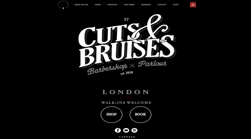
Cuts & Bruises is a London-based barbershop that channels a traditional vibe with a fun, contemporary twist.
Founded in 2016, its brand is built upon its quirky nostalgic character, something that has also played a large role in its Wix website design. In fact, if your business has a strong brand identity, we think Cuts & Bruises is one of the best Wix examples you can learn from.
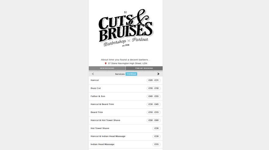
Cuts & Bruises has used Wix to create a bold and punchy aesthetic. Its monochromatic color scheme and stylized font choices reflect its unique brand personality, and we really like how they’ve used a one-page design to keep things simple.
Clicking on the headings in the sticky menu bar at the top will redirect visitors to the relevant part of the page, so there’s no need for endless scrolling. Plus, it also features a shop, and an online booking system, too.
2. l'Appartement Parisien
- Why it works: The minimalist visuals have created a contemporary, clean, and stylish aesthetic that’s a feast for the eyes. If your business is design-based, make sure that your website’s look reflects it. After all, you’ll want visitors to trust your skills!
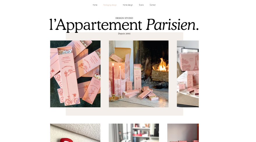
L’Appartement Parisien‘s website absolutely oozes class and style, which is a good thing considering design and aesthetics are its bread and butter! Founded in 2005, this French studio works with brands to curate beautiful packaging and interiors.
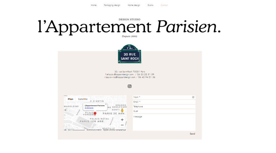
One thing that’s so great about this Wix website example is its fitting color palette. It features a mostly white background, but small pops of color are inserted in such a way that leads your eye cleverly down the page.
Its grid-like portfolio pages use scrolling galleries and high-resolution images to show off L’Appartment Parisien’s previous work, with each image expanding to full size when clicked on.
3. Mane
- Why it works: Mane’s stripped back style and elegant photography is a visual delight, while its clean layout makes it straightforward to find what you’re looking for. Remember to test out your website’s different areas and ensure that they’re a treat for the eyes and easy to browse.
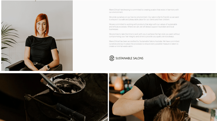
An Australian salon business, Mane is all about ethical hairdressing. It promotes a low-tox environment, and endeavours only to use products that are environmentally friendly and sustainable. Mane also has a passion for supporting local businesses, and promoting family-friendly values.
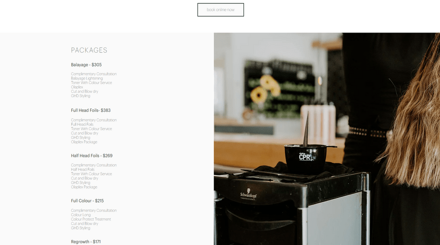
Mane’s ethos is very evident in its pared-back, stylish homepage design. Its white background allows the salon’s high-resolution images to pop off the page, showcasing the high standard of hairdressing on offer.
We particularly love how Mane’s Wix-created website is more than just a ‘pretty face,’ and plays an intrinsic part in the business’s day-to-day running. Prospective clients can find an up-to-date price list and an online booking system with just a few clicks.
- If you own a salon and are looking to take your business online, why not check out the 15 best salon website examples for a little more inspiration?
4. TerraLiving
- Why it works: Right off the bat, TerraLiving’s eye-catching product photography shows exactly what they’re selling – intricate terrariums – and features clear call to actions (CTAs) that’ll get customers shopping. Depending on your needs, you’ll need to place attractive call to actions across your website to get converting!
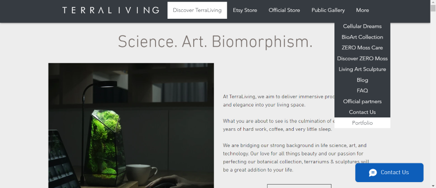
If you’re a fan of monochrome color palettes and strong clean lines, we think you’re going to like this next Wix website.
TerraLiving is a brand that explores the sculptural forms of terrariums, creating mini-ecosystems within geometric glass cases. These structures are just as much about the vessel as the living things within, and TerraLiving prides itself on its ability to create these living art pieces.
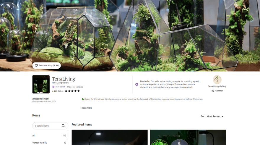
The website is very reminiscent of the terrariums themselves, consisting of clearly defined blocks and a contrasting color palette that gives the whole site a very dramatic feel.
As you scroll, the sections fade in and out like the fog wreathing the glass cases in the high-resolution product photos. The website is also directly linked to TerraLiving’s Etsy store, while an additional business blog makes for engaging reading.
5. The Sofia Log
- Why it works: This website is filled with character, from the bold backgrounds to the witty copy. It’s the kind of webpage that’ll leave a strong impression on its viewer. If you’re struggling to add some character to your website, it may be time to revisit your branding, from copy to colors.
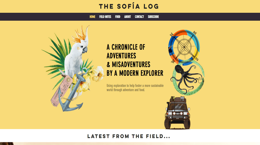
The Sofia Log is a blog that charts the adventures of Sophie Hollingsworth. She combines her passion for travel, food, and the great outdoors as she records and shares her stories. She’s been featured by both National Geographic and the United Nations, and – when not exploring – she works as a sustainability consultant in Sydney.
The Sofia Log’s bright and colorful homepage reflects the adventurous energy that prompted its founder to begin it in the first place. Quirky illustrations of everything from a parrot to a 4×4 demonstrate the fun and playful tone of the website, building a brand within the first few seconds of landing on the homepage.
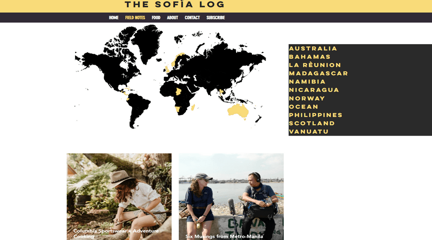
We love the self-deprecating tone that goes alongside the newsletter pop-up, and the interactive map is a unique navigation tool that’s bound to keep readers hooked.
- Interested in starting your own blog? Check out our 15 Best Blog Examples to get inspired!
6. Sonja van Dülmen
- Why it works: Sonja van Dülmen’s creative talents are reflected through the site’s striking, color co-ordinated homepage that switches between static and moving imagery for additional impact. It’s worth experimenting with movement on your page if you’re keen to create a more dynamic website.
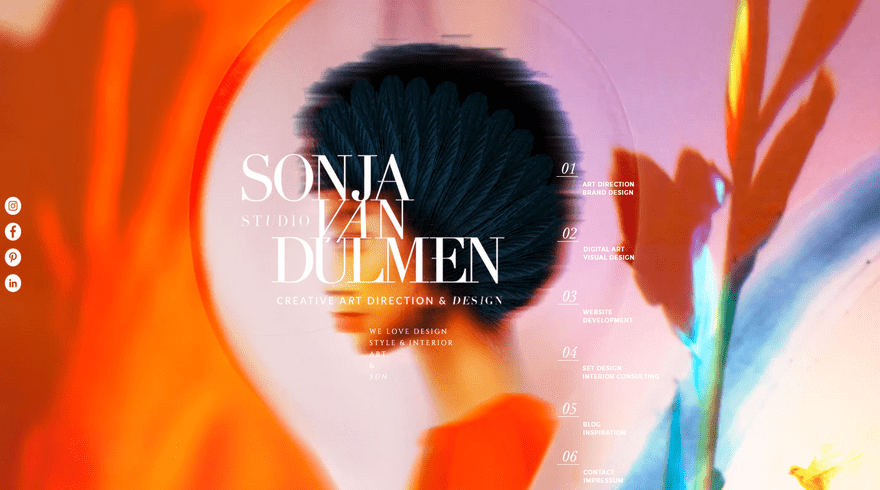
Considering that Sonja van Dülmen offers creative and artistic services, it’s no surprise that the brand’s website is all about visuals and images.
Specializing in everything from art direction and brand design to set design and interior consulting, this studio has a real passion for all things creative. If its many examples of previous work don’t prove that, then the vibrancy of its own website surely will!
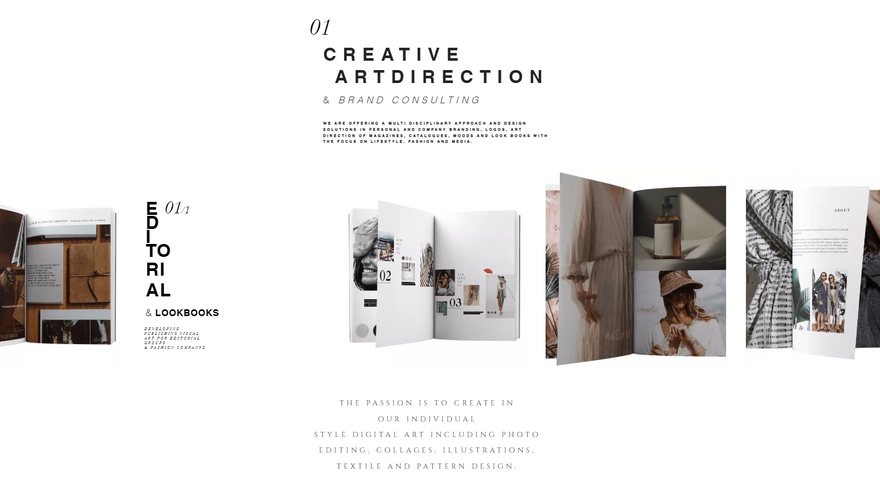
It really is a feast for the eyes. Moving pictures sit alongside static images, giving the whole website a unique dynamism. The homepage itself is split into rows, with each section showcasing one of the studio’s five art services. Users can view examples of previous work, and the grid layout of each row makes it easy to flick through the different parts of the portfolio.
A blog also allows users to see what the studio has been up to most recently, and gives an insight into the overall creative process.
7. Karlie Kloss
- Why it works: Karlie Kloss’s impressive career is reflected throughout her website, from the chic imagery to the minimalist layout. If you’re also in a professional field, you’ll want your website to reflect your industry expertise and authority.
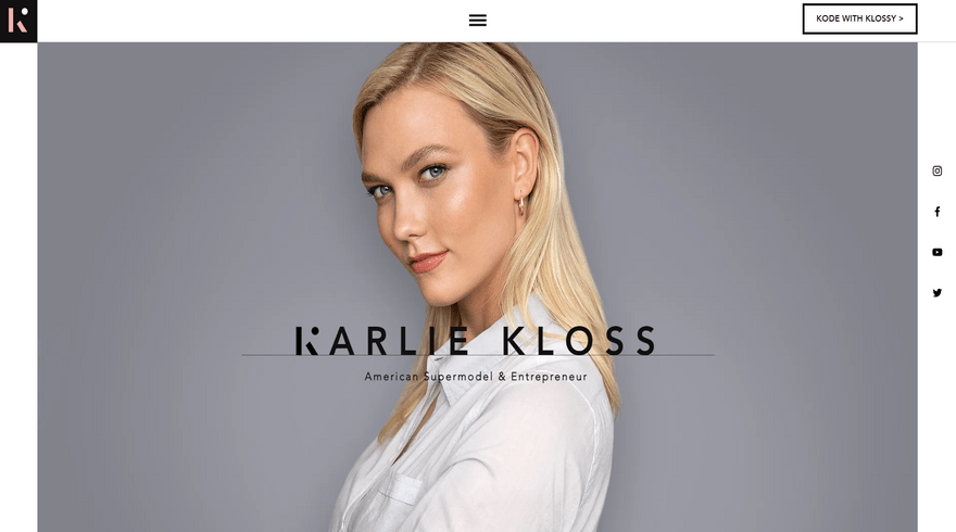
Karlie Kloss is one of the most well-known American supermodels on the planet, but that’s not all she’s known for.
In addition to her modeling career, Kloss is also a respected entrepreneur and philanthropist, who has most recently developed a passion for technology and coding. She uses her Wix website to connect her fans with all elements of her life.
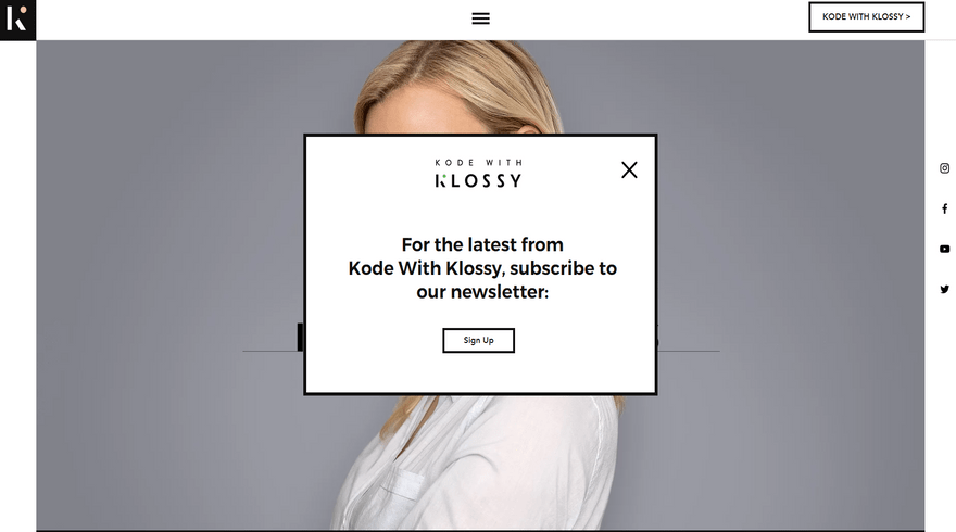
Karlie’s website has a clean, minimalist design that suits her professional background. The homepage centers around a clever feature that makes it seem as though the different components are emerging from behind a white blocky overlay. Overall, it gives the site a very slick, polished feel.
A non-intrusive pop-up canvases for email marketing subscribers, and an integrated social feed forms strong ties with Kloss’s Instagram account. This website strikes a lovely balance between images and text so that users feel informed, but not overwhelmed.
8. Izzy Wheels
- Why it works: Izzy Wheels’ kaleidoscopic color scheme is present throughout its website. It reflects the company’s empowering product while leaving website visitors in an uplifted mood. Keep color theory in mind when designing your website. How do you want people to feel?
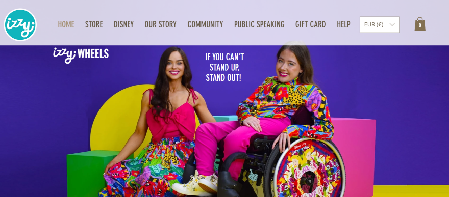
Izzy Wheels is the product of two sisters, Ailbhe and Izzy Keane from Ireland. Together, they create colourful wheel covers for wheelchair users, with designs spanning from dazzling florals and hearts to enchanting Disney character motifs.
The website is covered in strong branding. We love how important bright colors are to the brand, a fitting design choice that is felt across all pages. It really brings Izzy Wheels’ unique selling point to life.
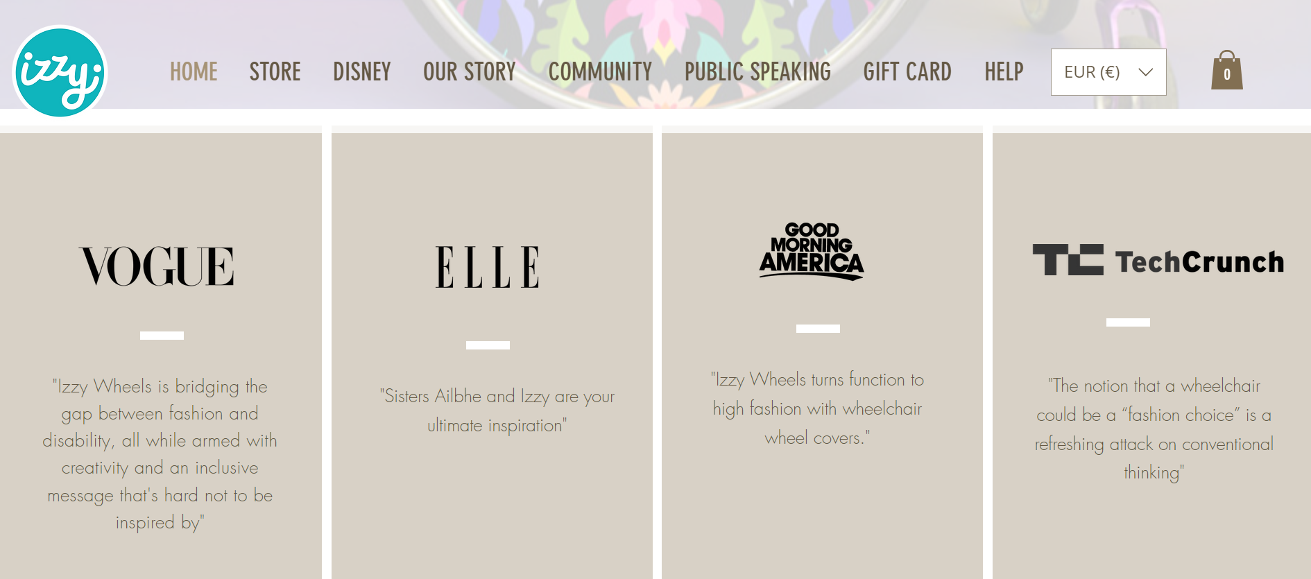
The header image features an empowering slogan: “If you can’t stand up, stand out!” This captures the brand’s ethos. Throughout the website, visitors will find eye-catching color photography with punchy backgrounds, a uniform product page design that’s easy to browse, and a sticky navigation bar enabling users to look through each page.
9. Puddin'
- Why it works: Puddin’ features everything you could possibly want from a restaurant website: delicious imagery, order buttons, an Uber Eats link, and a way to get in contact for catering services. Keep this in mind if you’re also serving up delicious food from your website.
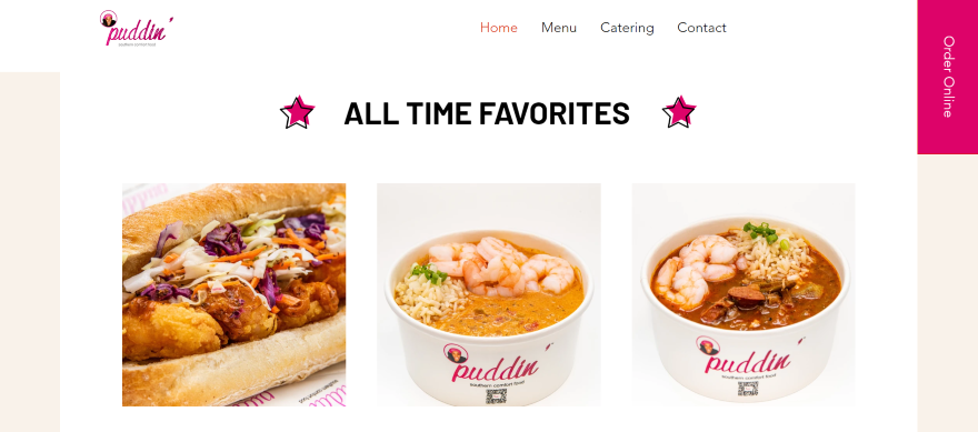
Toyin Alli started Puddin’ in 2010 when she became a street food vendor in the Eastern Market on Capitol Hill. She specializes in southern comfort food favorites, and sells her food in local markets and food trucks. She also provides independent catering for events and bookings.
Puddin’ has everything a food website could possibly want: online ordering, bespoke orders for events, a menu, and a link out to Uber Eats. It even has a vacancy page where aspiring Puddin’ enthusiasts can apply to join Toyin’s team!
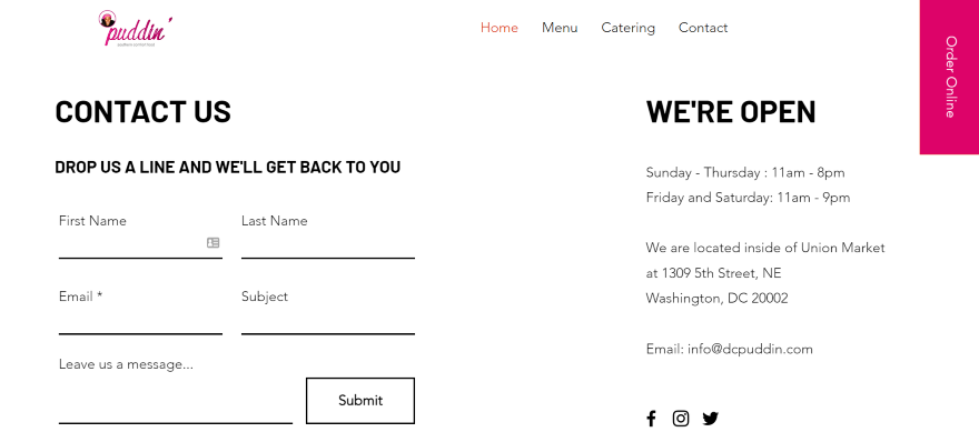
We really like the use of the large dynamic slideshow header at the top of the page. It allows Puddin’ to show off its mouthwatering dishes, as well as the team that works so hard to make it a success. Puddin’ also has a number of contact forms across the website, so there are plenty of ways for customers to get in touch!
Want to see some more drool-worthy food websites? Our article will take you through the best food truck websites.
10. Max Montgomery
- Why it works: Max’s photography is at the heart of his website: he keeps text to a minimum, and uses white space to break up the page’s design elements. If you also run a portfolio website, I recommend making sure that your work does the talking.
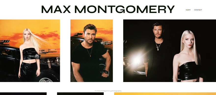
Max Montgomery is a British photographer who lives and works in New York. Photography very much runs in the family, but Max has found his own striking style, and has since photographed a number of well-known faces, including Camila Cabello, Heidi Klum, Snoop Dogg, Lizzo, and Willem Dafoe.
Max’s photography website has very little text on it. In fact, outside of the small menu at the top, every inch is taken up by his arresting photographs. Each of these can be expanded to full screen, so viewers can get up close and personal with them.
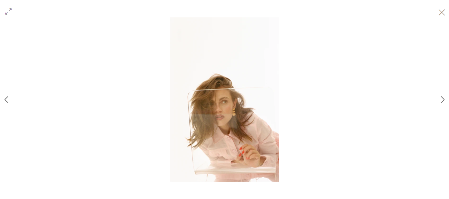
We also like that Max’s Wix website offers the option to scroll through all of his work in full-screen mode, rather than having to minimize each one before moving on to the next.
His contact page contains only his email address, and his ‘Diary’ is unlike any other blog, being composed entirely of images. Overall, it makes for a very striking and immersive browsing experience.
11. Brown Owl Creative
- Why it works: Brown Owl Creative specializes in website design, so it’s only natural for its own website to follow suit. The website’s seamless layout and impressive multimedia portfolio make for an engaging user experience, so think about the different ways website visitors could interact with content on your own website.
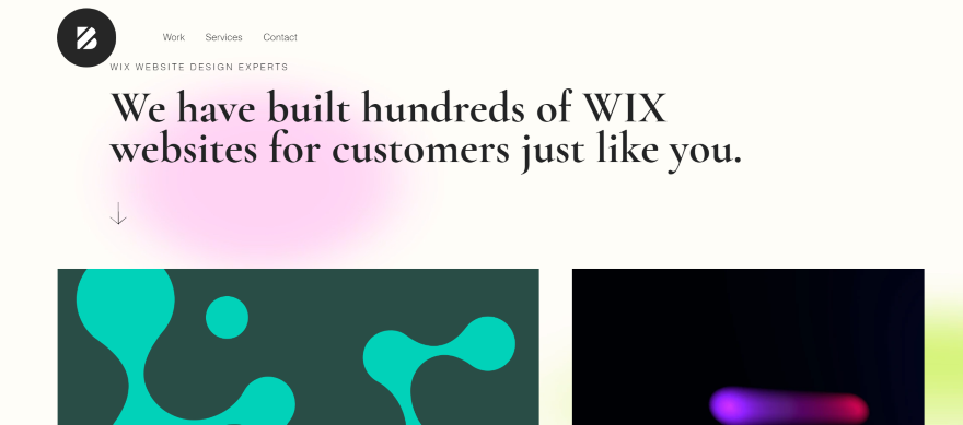
In its own words, Brown Owl Creative is a ‘multidisciplinary design company’ that has a particular focus on branding, design, and web development. It works with businesses of every size and shape to help them achieve their brand goals. Its list of clients is extensive, and you can view samples of the company’s work on its Wix-crafted website.
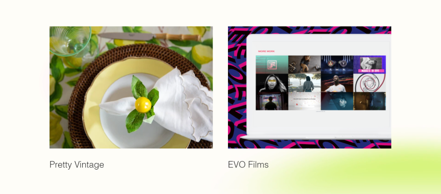
Brown Owl Creative’s professionalism is noticeable through its website’s gradient background and clean typography. Set in a tile layout, gifs and videos sit alongside static images and give a snapshot of what’s possible with this studio.
Similar to other creative websites on this list, Brown Owl Creative hasn’t overloaded each page with too much text, instead letting its visuals do most of the talking. We particularly like how the navigation menu is hidden away at the side, so it doesn’t detract attention from all the exciting work on offer.
12. Poke Bowlz
- Why it works: Poke Bowlz’ scrumptious food photography is enough to make you want to order one of its delicious dishes – helpfully, customers can order directly from the website! Make sure your product photos are equally as stunning if you run an online store. Avoid blurriness or busy backgrounds.
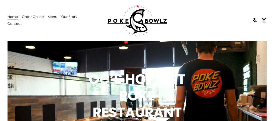
Poke Bowlz is a healthy fast-food business located in Southern California. Its food has its roots in Hawaiian and Japanese dishes, and is a unique twist on a popular favorite. It’s committed to delivering food that is fast, fresh, and healthy.
When it comes to food, images are key, so Poke Bowlz makes the most of the space it has by filling it with tons of drool-worthy pictures of the delicious ‘bowlz’. In the sections where there aren’t any photos, you’ll instead find glowing reviews from its loyal customers.
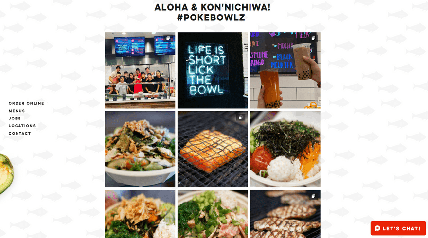
This Wix website also features differing menu pages depending on your location, as well as giving you the option to order online. The sticky side navigation menu travels with you as you scroll, so it’s there whenever a customer’s stomach gets the better of them! You’ll also find a chat box in the lower right corner, usefully situated for customers to ask questions before they order.
13. Animal
- Why it works: Animal knows how to make a great first impression. Its website’s dynamic video header and eye-catching grid layout dives the viewer straight into their work. If you’re also going to start with a large hero image or video, make sure it’s impactful.
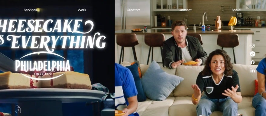
Animal creates music and sound design for big brands and businesses. It describes itself as a collective of artists and musicians who live by creativity, new concepts, and original content. Animal’s impressive array of clients includes Toyota, Pepsi, McDonalds, and even Wix itself.
This is another website that doesn’t use a lot of text and instead relies on images. The video header adds a contemporary flavor and showcases the company’s impressive range of work with flair.

Animal’s impressive portfolio is displayed in a grid further down the homepage, and – when clicked – each tile opens up into a video, without you needing to leave the page. Animal also sells merchandise, but this is an understated addition to the brand — there aren’t any product pages, just a pop-up asking for your size. We love how different this is from other brands!
14. Tobias Becs
- Why it works: Tobias makes use of video and succinct copy to tell website visitors everything they need to know about his personal brand. Similarly, make sure that every word on your website counts. What is the main message you want to spread about your business?
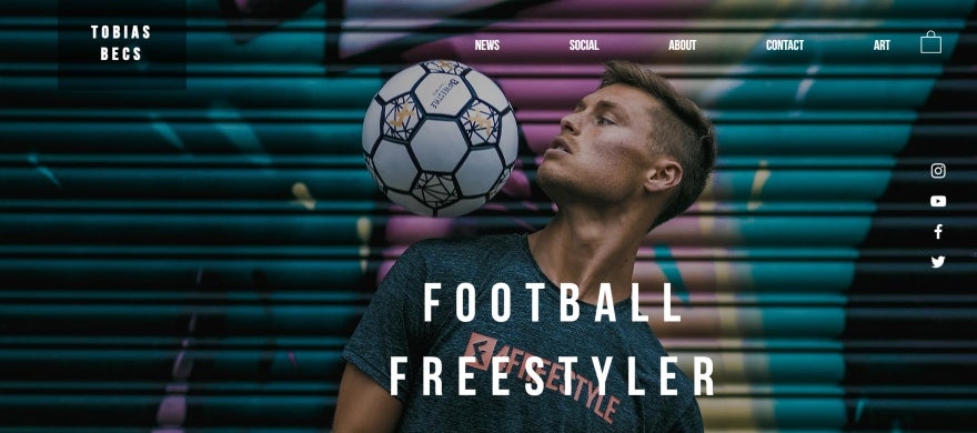
Tobias Becs is a freestyle football champion and the founder of 4Freestyle, a freestyle and street football lifestyle brand. He travels the world promoting the sport, as well as creating award-winning content and working with brands such as Renault.
Confined mostly to a single page, Tobias’s website pulls you in immediately thanks to his high-resolution image header. This also helps to position his brand at the center of his site — it’s impossible to ignore the connection between Tobias and football!
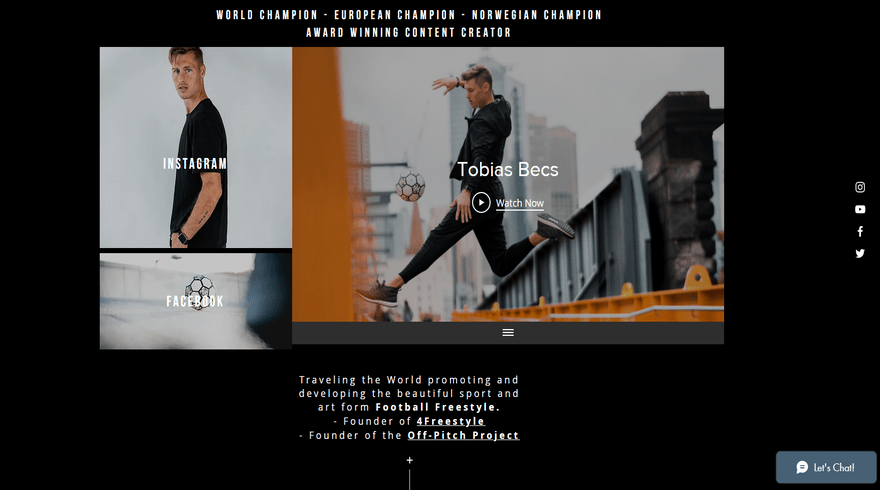
We really like the darker color scheme, which cleverly offsets the white text. Although there aren’t many written sections, those that are there pop off the page. We’re also fans of the way Tobias’s blog is full of vlogs, rather than traditional written posts. It makes for very easy viewing!
15. Rafael Varona
- Why it works: If you’re a creative, you’ll want to ensure that your unique visual style is shown across your website. Rafael achieves this by implementing his whimsical style through playful animations and fairy tale colors.
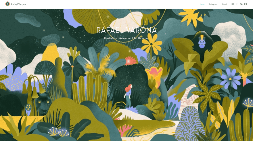
Rafael Varona is a Peruvian illustrator, animator, and art director who splits his time between Berlin and Rotterdam. He’s worked with a huge roster of well-known brands, including Disney, Intel, Adobe, Porsche, Snapchat, and Bacardi – to name but a few!
Rafael’s entire website is very fun and playful — just like his illustrations. The animated banner at the top of his homepage is an excellent way for him to showcase some of his best work, and visitors can scroll down to see more examples of his art.
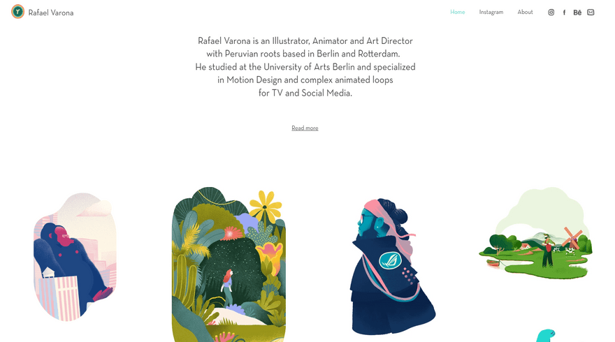
There isn’t a lot of text, with much of the space dedicated to images. Users can click on the thumbnail images to be taken to a dedicated project page that offers some context behind the work and the client it was created for. We like how the white background and tiled layout give a very polished finish, making it reminiscent of a social media feed.
Best Wix Website Examples: Summary
And there you have it — our 15 favorite Wix website examples! We’ve covered everything from food trucks to terrariums and high-fashion photography, but one thing is for certain: each of these websites demonstrates the near-unlimited creative potential you can enjoy when you build your website with Wix.
But before we finish, here are the key learnings to take away from the examples we’ve seen:
- Think about the user experience – Before you hit publish, make sure that your website’s design is easy to navigate. You don’t want visitors to get frustrated then leave early!
- Design is key – Ensure that your website’s design is consistent across all of its pages. This includes a recognizable color palette, a clear tone of voice, and harmonious imagery. If the design gives off mixed messages, you’ll end up confusing visitors.
- Anticipate your visitor’s needs – Your overall design needs to be influenced by your customer’s needs. If you own a portfolio website, make sure that your work is easy to view. Or, if you own an online store, check that your product photography is clear, enticing, and clickable.
We hope you enjoyed looking through them, and are now feeling inspired to set off on your own website designing adventure!
Not sure if Wix is the right fit for you? See what else is out there with our guide to the best website builders.

Leave a comment