Checkout Page Optimization: 17 Killer Tips for Boosting Conversions
If you click to purchase a product or service based on our independent recommendations and impartial reviews, we may receive a commission. Learn more
Cart abandonment can massively affect ecommerce conversion rate optimization. For those of you who aren’t familiar with the term, it’s how you turn more visitors to your site into customers. Oftentimes, visitors will put products into their carts and abandon them, meaning you lose precious sales. When there are so many more people selling online thanks to social media and website builders, you can’t afford to lose customers!
Ecommerce brands lose around $18 billion in revenue each year thanks to cart abandonment. To reduce these abandonment issues, you must optimize your checkout page. In fact, improving your checkout page can increase your conversion rate by 32.26%. Impressive!
With years of experience in web design, development, and UX (user experience), we’re not only experts in the ecommerce space, but we know exactly how to optimize a checkout page design in order to maximise sales.
This article will show you 17 actionable tips on best practices for your checkout page optimization, covering aspects such as layout and design, product details, payment, and shipping.
Let’s check ‘em out in more detail, shall we?
1. Build Trust and Security
Online shoppers need to trust your brand if they’re going to complete a purchase on your website.
To build trust in your website, display trust badges and security seals throughout your website and assure users of a safe and secure checkout process.
Be sure to include detailed returns and refund information to help further create a sense of trust and reliability.
Find Out More
- Learn more about Website Security for helpful tips on securing your site.
- When securing your site, refer to our Website Security Checklist to stay on top of security measures
2. Minimize Headers and Footers To Remove Distractions
The only thing your visitors should be looking at on your checkout page is the online checkout. Remove the navigation header and footer menus, or swap them with shipping and payment processor information, or trust signals like your TrustPilot rating.

3. Reduce the Number of Form Fields
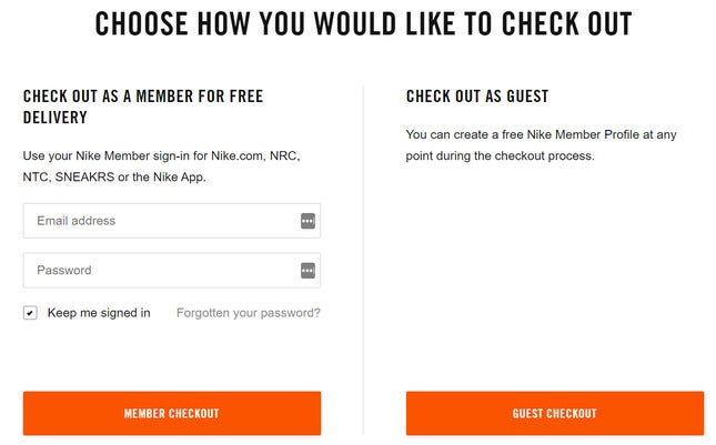
Research shows that the fewer fields that customers need to fill in, the higher the UX performance rate of the checkout, i.e. the more likely it is the customer can finalize the purchase quickly and easily.
The same study showed the average number of checkout steps among the top 60 US and EU online retailers is just 5.1. Two of the best ways to act on this tip is to allow visitors to tick a box if their billing and delivery addresses match, and to offer a guest checkout option.
4. Add Multiple Checkout Buttons to Your Product Pages
This is basic CRO (conversion rate optimization). By reducing the time customers spend looking for those add to cart buttons, or ‘conversion points’, the more likely it is they’ll take action.
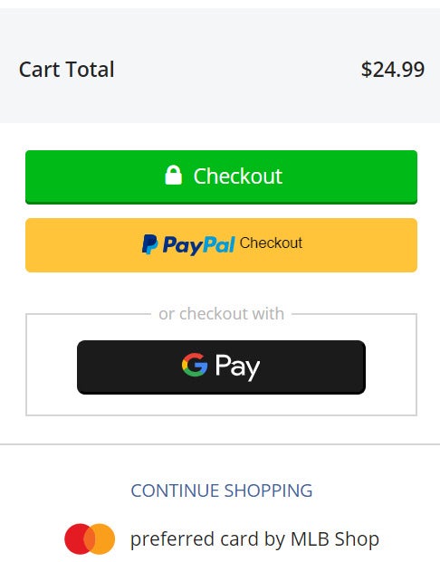
5. Differentiate Colors for ``Checkout`` and ``Continue Shopping`` Options
Firstly, you should always offer users the chance to continue shopping while they’re on your checkout page. With that in mind, you should make the two options visually separate to create a seamless shopping experience.
6. Optimize Call-To-Action Buttons
Call to action (CTA) buttons are one of the key ways you’ll encourage users to take action and make a purchase.
When writing calls to action, use clear and compelling text within your buttons, keep it short and sweet, and make sure it’s obvious what you want users to do e.g. “continue shopping”.
Make sure your CTA buttons stand out from the rest of the page and are easily clickable on both desktop and mobile devices.
7. Include a Product Summary
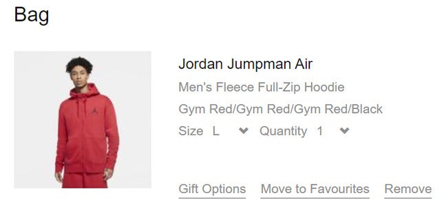
Using codes to categorize items might work in your database, but not for the user. Instead, you should provide a short summary of the product/s at the online checkout, reminding the customer on the product’s size, color, or variant.
8. Make It Easy To Update Quantity and Remove Products
You must reduce the probability of the user leaving your checkout page for any reason. Providing simple tick boxes to enable users to update the quantity or to remove an item entirely should keep the user from reverting to the storefront.
9. Recommend Related Products Before the Checkout Page
Shoppers love a personalized shopping experience, but you need to offer suggestions at the right stages. By ensuring the user has everything they need before reaching the checkout – e.g. a set of batteries or an adapter – you’re making the user’s life a whole lot easier by removing the need to start shopping all over again. A happy customer is happy profit margins!
10. Confirm Product Availability From the Beginning
Let’s say you’ve placed an item in your cart, gone to the checkout and entered your information, only to then discover the item’s out of stock. You’d abandon the cart, right?
That’s why, when you’re designing your product pages, make sure your storefront always indicates the availability of a product, giving visitors the chance to actually pick and buy an item that’s in stock in the first place. Learn how to handle out of stock in our full guide.
11. Optimize for Cross-Selling and Upselling
Cross-selling and upselling are two of the best ways to encourage users to make bigger purchases and spend more on your website.
Cross-selling is when you offer users related products to the one they are already buying. For example, if they are buying a cell phone, you can cross-sell a phone case for the make and model they have chosen.
Upselling, meanwhile, is the process of encouraging users to purchase a better or more expensive alternative. For example, you may suggest a version of the cell phone with more in-built storage or a better camera.
Feature recommended or “better” products as part of your checkout process and make adding them to the shopping cart from the checkout page quick and simple.
Find Out More
Check out our guide on How To Upsell for more tips to follow!
12. Allow for Multiple Payment Methods
With the diverse nature of online payments these days, you’ll need to accommodate for more than just credit cards on your checkout page.
Nowadays, consumers might want to use digital wallets such as PayPal Checkout, Apple Pay, or AliPay (if they’re based in China), so you should always give them the option.
This is where the majority of carts are abandoned. If you’re wondering how to accept payments online and keep your customers happy, then you must be flexible on your payment offerings.
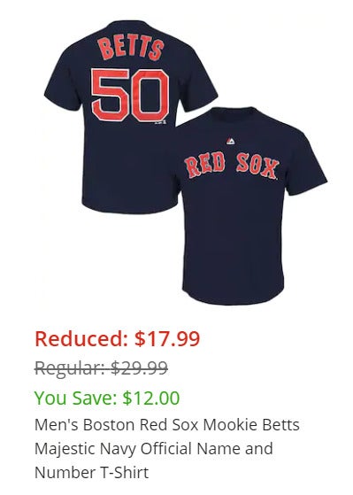
13. Show the Customer How Much They've Saved
This will reassure the shopper and make them feel more comfortable about finalizing that purchase. Just think, if the customer is happy with their level of spending, they’re unlikely to abandon the cart.
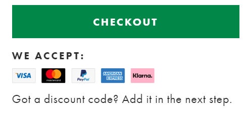
14. Offer Discount Codes
55% of shoppers have abandoned their cart because the cost was too high, while 32% have abandoned because they found a discount with another retailer. The message here? Don’t discount the value of rewards and coupons – they could be the difference between turning a user into a customer or cart-abandoner. Even better than that, it could increase customer loyalty long-term if you’re smart about using discounts to draw customers back to your store.
15. Implement Social Proof and Urgency
Displaying customer testimonials and reviews for both individual products and your brand as a whole is a great way of adding social proof to your checkout process.
One of the oldest tricks in the book when it comes to checkout page optimization is to add urgency and time-sensitivity to the checkout process.
For example, you can show users real-time stock availability for the items they have added to their cart, creating a sense of urgency for them to complete their purchase before the item sells out.
You can also promote a limited time deal, for example “buy one get one free until midnight tonight”, to push users towards completing their purchase.
Find Out More
To effectivey use this strategy, you need to have a good handle on your stock levels. Our guide on How To Manage Your Ecommerce Inventory can help!
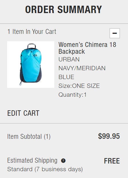
16. Offer Free Shipping
79% of US consumers said that free shipping would make them more likely to shop online.
If your profit margin allows, you should offer free shipping to ensure the customer has little reason to abandon the cart at the last minute. At the very least, you should offer free shipping when the user spends a certain amount.
By offering free shipping, you’re likely to attract more customers that you would without, which would boost your bottom line in the long run anyway.
Research has shown the number one cause for cart abandonment is surprise costs in the checkout page. It should come as no surprise, then, that our main tip is: no surprises! Always be upfront about shipping costs and tax from the beginning of the buying journey.
Find Out More
To provide accurate shipping costs with no surprises, you need to be clear on how much shipping will cost. Our guide on How To Calculate Shipping Costs For Your Online Store will help you work it out and apply it on your own store.
17. Include Approximate Delivery Date
It’s that word again: transparency. You’ve asked the user for their zip code and cell phone number, so the least you can do is provide an estimate for when their order will arrive. This may seem small, but it all counts towards building invaluable brand trust.
Checkout Page Design Tips: Summary
You’re now ready to create a user-friendly checkout page. Your payment page must be quick and easy to navigate, without any cost-related surprises that are likely to scare users away. Let’s recap our top tips…
The Best Ways To Improve Your Checkout Page
- Build trust and security
- Minimize headers and footers
- Reduce the number of form fields
- Add multiple checkout buttons to your product pages
- Differentiate checkout and continue shopping buttons
- Optimize call-to-action buttons
- Include product summary at the checkout
- Make it easy to update product quantity and remove items
- Recommend related products before the checkout
- Confirm product availability
- Optimize for cross-selling and upselling
- Allow multiple payment methods
- Display how much the user has saved
- Offer discount codes
- Implement social proof and urgency
- Provide free shipping
- Include approximate shipping dates
For many online stores, the checkout page is a burial ground where finalized transactions perish and carts are abandoned. But if you follow our 17 checkout page optimization tips, then your business should enjoy healthy sales margins.
Fancy learning more about rescuing abandoned carts? Take a look at our guide to the best abandoned cart emails.


Leave a comment