Add-To-Cart Buttons: Tips, Examples, and Best Practices
If you click to purchase a product or service based on our independent recommendations and impartial reviews, we may receive a commission. Learn more
Selling online and building an online store doesn’t have to be hard. But creating a website is just the beginning when it comes to setting up a successful ecommerce business. Once built, you’ll need to consistently test and tweak your store to drive better results. This can include factors ranging from improving website speed to tweaking copy.
One crucial, but often overlooked, aspect of online store performance is your add-to-cart button. In this article, we explore best practices and offer top tips for getting the most out of this small, but mighty website button.
What is an Add-To-Cart Button?
An add-to-cart button is much as it sounds. It’s the button you find on a product page that lets you add that product to your shopping cart. Once in your cart, you’ll be directed to the checkout page to buy the product, along with any other products you’ve selected.
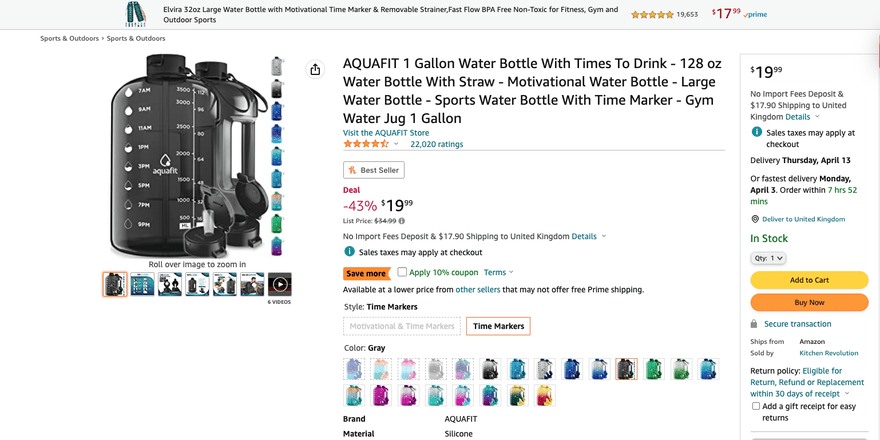
In some stores, such as Amazon, a combination of buttons is used. One that lets you add a product to your cart, and another that lets you automatically purchase an item without the need to add it to your cart.
But how do you get the most out of your add-to-cart button? Let’s find out!
Why Does Your Add-To-Cart Button Matter?
It might seem a little insignificant. After all, it only takes up a very small fraction of your product page. So, why do you need to take time to improve your add-to-cart button?
Your add-to-cart button is an important part of your customer journey. Allowing customers to add multiple items to their cart helps them plan and compare the products they want to buy.
It’s also a strong signal from your customers that they’re close to making a purchase – the simple act of adding a product to the cart could result in a sale. But even if it doesn’t, that information will help you identify where changes may be needed to drive better results.
For example, if an item often gets added to a cart, but rarely gets purchased, this may tell you that something is putting buyers off. In turn, you can then research and test factors that could increase sales, such as price or how you present the product.
Having an attention-grabbing add-to-cart button will help you increase the number of clicks. Some stats suggest that the average add-to-cart rate is around 7%. This leaves plenty of room for improvement!
Add-To-Cart Button: Tips & Best Practices
So, how do you get the most from your add-to-cart button?
In this section, we offer you some of the best add-to-cart tips, tricks, and best practices:
Pick a Bold Color
Your main objective with an add-to-cart button is to grab the attention of potential customers.
They’ve already shown interest in the product by viewing all the product information on the page. So, the next step is to convince them to click that valuable add-to-cart button.
Using bold colors is a great way to draw their eye to this area.
Which color you use is up to you. You may want to use a custom color that closely matches your brand image. Alternatively, you could opt for a color that really stands out such as bright orange, red, or green.
Your chosen color palette can also help you provoke emotion.
For example, red can provoke feelings of passion and love, while green could provoke feelings of abundance and nature. One good method is to match the color with the emotion a customer should feel when buying. This may include using green when selling an eco-friendly product, or using red when selling a product often given as a romantic gift.
Round the Edges of the Button
Rounding the edges of your add-to-cart button may seem like a small tweak, but it can have a big impact on your success.
Studies have shown that rounded edges are more pleasing to the eye and more likely to draw a visitor’s attention. So, by using rounded edges you increase your chances of getting that click.
Use White Space
White space is a powerful design tool that can be applied to everything from your homepage to your checkout page. By using plenty of white space on your product page, especially around your add-to-cart button, you add more weight to each element.
It also makes it easier to scan the page, helping visitors quickly identify the key information and what they need to do next (in this case, click the add-to-cart button).
Failure to use white space can confuse potential customers if their screen is overwhelmed with content, which could put them off wanting to buy anything at all.
Track Performance
Tracking data from your add-to-cart button can help you increase your store’s overall performance. This can be achieved fairly easily by using free tools such as Google Analytics.
When assessed and investigated, the data you gather from your add-to-cart button analytics can help you better understand multiple aspects of your business including:
- Buyer behavior
- Pricing strategies
- Website usability
- Product popularity
- Add-to-cart button performance
- Abandoned carts
For example, you may get a high volume of product page visitors, but few of those visitors click add-to-cart. This tells you that you need to investigate several areas, such as product cost, product information, and add-to-cart button design.
Consider AB Testing
Although we can offer you tips on creating the best add-to-cart buttons, these are only “best practices”. Creating the best-performing button for your own unique business and audience will require testing.
AB testing can help you better understand which factors impact button performance. This type of testing simply compares two versions of something to see which performs better.
Factors you may test include:
- Button position
- Button size
- Button color
- Button wording
- Button shape
When using AB testing for your website, you should aim to change just one of these factors at a time to avoid confusion. For example, if you test two buttons that have different colors and different wording, it’ll be hard to know what factor impacted performance when reviewing the results.
Add-To-Cart Button: Examples
Below, we’ll share some examples of add-to-cart buttons in use and explain why they’re so effective.
Amazon
Amazon’s classic product pages offer plenty of product information. But they also use whitespace and bright colors (yellow) to make its add-to-cart button stand out when customers are browsing the website.

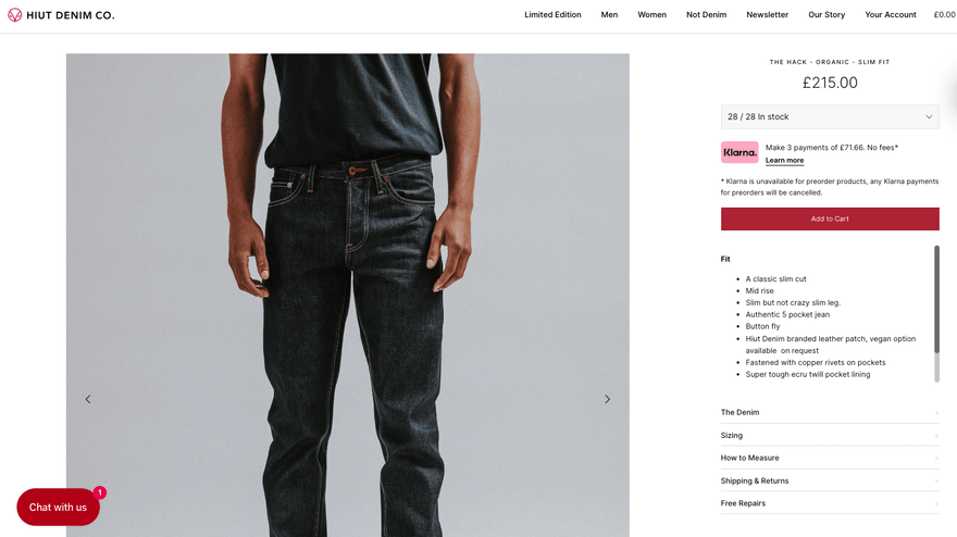
Hiut Denim Co
Hiut Denim Co is a premium denim brand located in the UK. The business has designed its add-to-cart button to better fit with its website’s aesthetic and to bring it in line with its branding.
This subtle approach is more common for luxury and premium brands that want to avoid being too loud or garish with their website content.

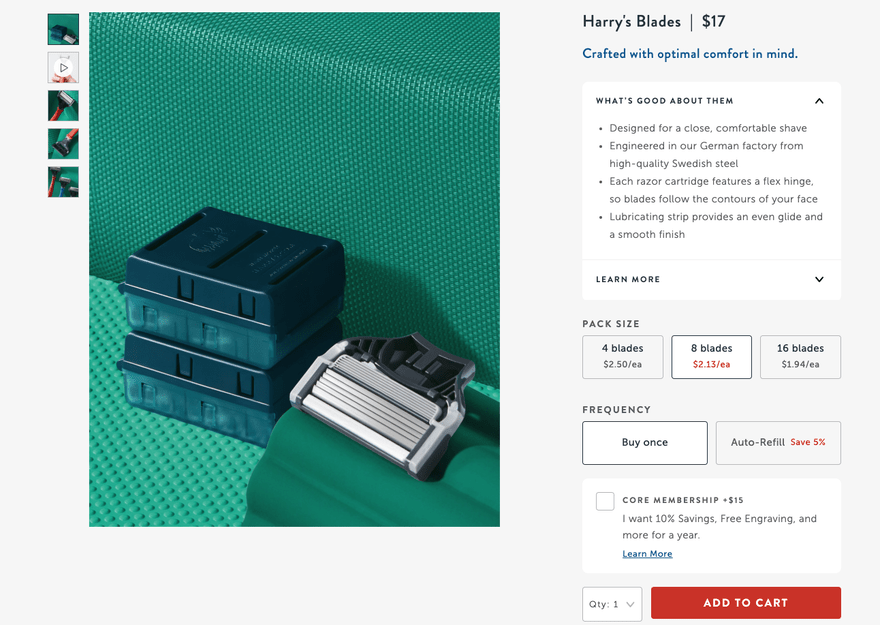
Harry’s
Harry’s offers viewers multiple product options as part of its user design. The add-to-cart button is the most prominent part of this section and uses a simple but bold design to capture the attention of website visitors.

Add-To-Cart Button: Summary
The add-to-cart button is an essential aspect of your website and online store. Getting it right will help you grab the attention of potential customers and encourage them to click, ultimately leading to more sales. And with the data provided by this button, you can also identify any key areas for improvement.


Leave a comment