Website Design Mistakes To Avoid (And How to Fix Them!)
If you click to purchase a product or service based on our independent recommendations and impartial reviews, we may receive a commission. Learn more
With the support of a website builder, it’s easy to feel confident in your design skills. After all, Wix and Squarespace can help a beginner create a stunning website in a day. Understanding what web design is and its key principles can bring your site from good to great.
But website design mistakes happen – from a complex and cluttered layout to low-quality content. Fortunately, we’re here to highlight these common errors and give you practical tips on how you can fix them. So, if you want to breathe new life into your website and engage your visitors with a user-friendly experience, read on!
1. Cluttered and Complex Design
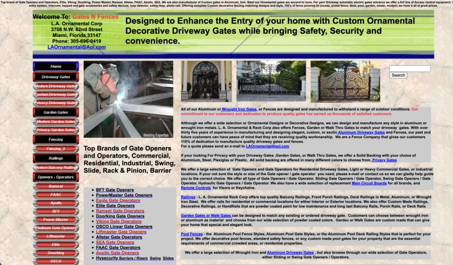
One of the website design mistakes that we see the most is busy and cluttered pages. It could have an overwhelming amount of text or imagery, or there’s just too much going on in one place – you don’t know where to look because everything’s competing to get your attention.
It confuses visitors, making it difficult for them to find the information they need and potentially deterring them from exploring further.
On the other hand, a website with too little content or very few design elements may leave users guessing what your business does. It can also give off an unprofessional vibe.
How To Fix It
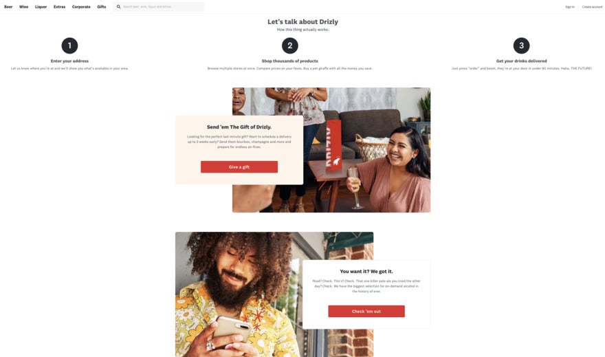
To avoid a cluttered design, it helps to go for a streamlined look with lots of blank space (otherwise known as white space). It’s about finding a good balance – you don’t want your website to appear too sparse either!
We recommend using a simple design that delivers clear messages. Add easy-to-read fonts, and break up text with photos and graphics. When things are visually balanced, users feel more relaxed and the website’s easier to navigate.

Find Out More
For some good examples of minimalist design and clear navigation on real-life business websites, take a look through our examples of Corporate Website Design for inspiration.
2. Inconsistant Branding
This web design mistake is pretty common with small businesses that don’t have a lot of experience when it comes to marketing.
Inconsistent branding shows up in a variety of ways across a website. Using different fonts, color schemes, and logos on your pages, as well as content that clashes with your business values creates confusion and brand dilution.
How To Fix It
Consistency across your website helps people get a better idea of who you are and what your business offers. The website should align with your brand personality by using consistent fonts, logos, and colors. We recommend gaining a basic understanding of color theory and applying it to your website, socials, and other branding for consistency. We also recommend making sure all of your content and images are relevant to your website. These steps can contribute toward improving brand recognition, which subsequently builds trust and familiarity between your business and your audience.
3. Lack of Clear Call-to-Action (CTA)
A call to action (CTA) is a button that tells visitors what they should do next on the website.
You could use a CTA to encourage people to sign up for a newsletter, purchase a product, or find out more information. They’re shortcuts that take a user exactly where you want them to go, guiding them on their customer journey.
Unfortunately, many businesses make the common web design mistake of not using CTAs. This means they miss opportunities to convert users into customers.
How To Fix It
Adding effective CTAs to your website isn’t a time-consuming task! They should be easy to spot and scattered throughout the website. They should also guide your users to a clear and specific action, like subscribing to a newsletter.
Color and CTA shape will help you get attention, and the CTA copy should show the value of clicking on the button. In other words, “Get report here” isn’t as good as “Get FREE report here”.

4. Poor Navigation and Information Architecture
No matter what kind of website you have, users need to be able to find their way around. Navigation should be intuitive, but lots of websites fall short in this category. You don’t want a reader looking for the “About Us” page to somehow find themselves on a product page for shoes.
When a website is confusing and complex, it’s hard for visitors to find what they need. They get frustrated, and it’s likely they’ll bounce off your website to find one that’s easier to navigate – and it’s best to keep your bounce rate to a minimum.
How To Fix It
The best thing you can do when designing your website is to consider the user journey. See things through the eyes of your website visitors. What would you find annoying? Can you think of a positive experience you’ve had with a website? Make note of what you like and don’t like, and incorporate your findings into your site.
Bounce rates increase by 32% when a page load time goes from one to three seconds, so you must optimize your website’s structure and navigation to keep users on your site.
When you organize your content logically and use thoughtful categories for sections, you create a seamless user experience.

5. Ignoring Mobile Responsiveness
There are certain important things for websites that you need to succeed online. And mobile responsiveness is one of them! At least 79% of smartphone users have used their phones to buy something online in the last six months, and 80% of shoppers use their smartphones to look up product reviews and compare prices.
When you neglect to optimize your website for mobile devices, you miss out on a huge opportunity. Users quickly get frustrated when they can’t see photos, text, or where they’re supposed to go next.
How To Fix It
Plenty of website builders will automatically make sure your website adapts seamlessly to various mobile screen sizes, but it’s good practice to check anyway. Regularly test your website’s mobile performance and always adjust it to make it better. Are the photos easy to see? Does any information bleed off the edges of the screen? Are any CTA buttons or other links invisible?
6. Lack of Contact Information and Customer Support
A lot goes into creating a successful website, so it can be easy to overlook certain areas. And plenty of websites forget to include contact information or customer support options.
This is how customers find answers so it’s a web design mistake you should avoid at all costs. If customers have no way of getting in contact with you, it not only generates unease but can damage trust in your business.
How To Fix It
The easiest way to fix this web design mistake is to make sure your contact information is easy to spot. Most businesses include a phone number, email address, and address (if available). As we’ve already mentioned, clear contact information and customer support options on websites can help build customer trust.
When it comes to customer support, we recommend integrating live chat or chatbot functionalities onto your website. This gives customers access to your business 24 hours a day, seven days a week – and they get a solution to their problem right away.
Something that boosts trust is integrating live chat or chatbot functionalities on the site. Customers love it because it gives 24-7 accessibility to your business. They get their questions answered right away.
In fact, live chat support can increase your website’s conversion rates by 82%, so it’s definitely something to keep in mind when designing your website!
More Information
- Key Ways AI is Benefitting Customer Service: Learn how AI can help your business handle customer service
- Conversational Commerce Statistics: Everything you need to know about live chat, chatbots, and voice search
7. Ignoring On-Page Optimization
On-page optimization plays a vital role in SEO success, yet many small businesses frequently overlook it.
On-page SEO, especially elements like meta tags, title tags, and alt tags, helps search engines understand your website – what it does and what it’s trying to say. As a result, users are more likely to be presented with your website if it’s relevant to their online search.
Without taking steps to optimize your pages, your website risks losing out on organic traffic from search engines like Google. Poor visibility means fewer visitors.
How To Fix It
Use unique and descriptive meta tags for each page, and make sure you bring in those targeted keywords in a way that feels natural. This helps relevant pages get found in search results and informs readers about the kind of content you have.
You can also include alt tags with descriptive text for images which makes your site more accessible for visually-impaired customers.
Here’s how it might look:
Title Tag: This is the title of a web page as it appears on the search engine results page (SERP). For example, “The Best Website Builders: Top 10 Reviewed”.
Meta Description: This provides a summary of your page’s content. Using the same example above, your description could look like this: “We’ve tested and reviewed the best website builders covering pricing, features, and more. Find the best builder to get you online.”
Heading tags: Headings throughout the article should act as signposts to your readers. They signal a key topic that will be discussed in more detail, and they make it easier for users to skim through your page if they’re in a rush to find what they need.

More Information
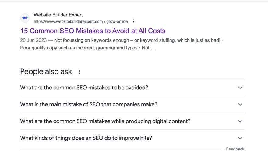
- Common SEO Mistakes to Avoid: Improve your SEO practices by avoiding these mistakes
8. Overlooking User Experience (UX) Factors
One of the biggest web design mistakes comes down to user experience and how customers engage with your website. With poor navigation, no CTAs, and messy pages, visitors will struggle to connect with your brand. This can lead to higher bounce rates and poor conversion rates – something to avoid, for sure!
How To Fix It
There are plenty of ways to fix your website’s user experience. First of all, you’ll want to create a visually appealing design that’s easy to use and navigate. For example, the color scheme shouldn’t be harsh on the eyes, and your page layouts should make sense – you don’t want a link to your Instagram feed where you’re discussing delivery options.
We also recommend that you conduct user testing (across all kinds of devices!) to get feedback. What works for them? What doesn’t? Did they find you easily? Did they know where to go? Is anything turning them off? You can then use this data to improve your website.
Find Out More
Want to see some of these web design mistakes in action? Take a look at our list of Bad Websites where we’ve compiled some of the worst website designs we’ve found!
9. Low-Quality Content
Your website is usually where customers find out more about your business or look to purchase products. Chances are, they may have had a look at your competitors’ websites too. And whether or not they realize it, they’re going to compare things.
Blurry images, content not written with your user’s needs and problems in mind, and irrelevant content can harm your brand reputation because low-quality content is seen as unprofessional, sloppy and cheap.
It can even impact your SEO. Here’s how:
- Lower rankings – Search engines prioritize high-quality content.
- Higher bounce rates – People run for the hills when they see bad content.
- Fewer backlink opportunities – Other websites won’t want to link to yours.
- Loss of trust – Your audience won’t come back if they’re turned off by what you’ve posted.
So how do you avoid these problems?
How To Fix It
You must focus on using high-quality images and videos that are suited for each platform you use. Prioritize writing for the user and their needs in your brand’s voice. Don’t make everything a selling point – show the user that you care about them by providing helpful and relevant content.
When you invest time and effort into creating valuable content that informs and engages your audience, customers are more likely to return.

Website Design Mistakes: Summary
We know it’s really tricky to find the time to make sure your website is offering a mistake-free user experience. While mistakes are hard to avoid all of the time, being aware of them is the first step!
These are the main website design mistakes to avoid:
- A cluttered and complex design
- Inconsistent branding
- Lack of a clear CTA
- Poor navigation and information architecture
- Ignoring mobile responsiveness
- Lack of contact information and customer support
- Ignoring on-page optimization
- Overlooking UX factors
- Low-quality content
Fixing these common design slip-ups will not only help potential customers find you and your products easily but will also improve your brand’s reputation overall. That said, you can still have fun with your web design. We recommend taking a look at these examples of our favorite weird websites for inspiration of how you can think outside the box!
There’s one main theme that connects all the mistakes we’ve discussed, and that’s user experience. Always think about your visitors and how your design choices affect them. People are more likely to trust and purchase from a website they admire and enjoy browsing!


Leave a comment