Web design needs to place even greater importance on mobile experience and unbeatable UX, including fast-loading speeds, helpful support, and easy-to-navigate pages. Designing with these factors in mind also caters to Google’s Core Web Vitals, a set of signals that contribute to the Page Experience ranking factor. But how? And what exactly is web design?
It only takes 50 milliseconds for visitors to form an opinion about your website. That’s right — in just a fraction of a second, they’ll decide whether your site looks professional and whether they want to stay or leave.
In short, visitors will immediately judge your website based on the quality of its design.
In short, user experience should be at the heart of your design choices to keep your visitors happy and your SEO in league with your competitors. Here’s a quick look at the top design trends:
- Mobile UX
- User-Generated Content
- Interactive Elements
- Goodbye Minimalism, Hello Neubrutalism
- Retro Resurgence
- Voice-Activated SEO
Whether you’re building a brand new site, or you’re wondering how to keep your existing site’s design fresh and engaging, we’re here to help you succeed. We’ve tracked the trends, analyzed the stats, and are ready to show you how to make your site look awesome.
Trend #1: Mobile UX
The Stats Behind the Trend:
- 53% of mobile users leave a website if it takes longer than three seconds to load
- 68% of companies with mobile-first web design increased their sales.
- According to website design statistics, 79% of users go back to search if the page they landed on isn’t mobile friendly
What Is It?
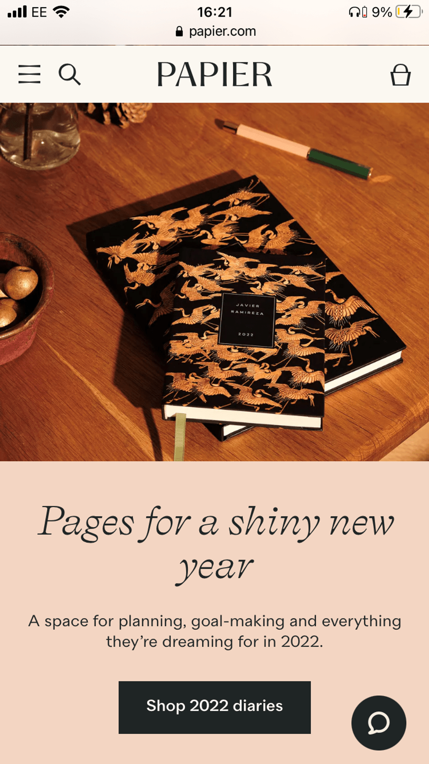
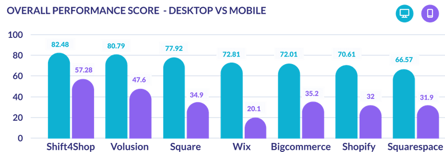
Mobile UX is already important, but many sites are still behind the times when it comes to providing a stellar mobile experience. When we tested 3,000 URLs against Google’s Core Web Vitals, mobile sites performed consistently worse than desktop — a worrying statistic, since Google usually crawls mobile sites to determine rankings.
Factors such as loading speed, ease of navigation, and a clean layout are just some examples of the metrics that combine to create a good mobile experience. 74% of users are more likely to return to a mobile-friendly site.
Why Does It Work?
There’s no denying the importance of mobile. Google cemented mobile’s importance back in 2015, when it announced that the mobile-friendliness of a website was becoming a ranking factor. Today, Google usually crawls mobile sites rather than desktop to determine rankings, so it’s vital to have a good mobile site if you want to rank well in search results.
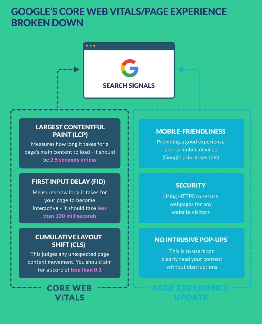
More recently, Google’s Core Web Vitals ranking signals a call for improvements to page experience, prioritizing pages that deliver fast loading, interactive, and stable content.
However, when we tested 3,000 URLs to see how ecommerce sites were performing against this new set of metrics, the results for mobile weren’t good. The results show that desktop consistently outperforms mobile, meaning mobile experience is lacking when it should be top priority!
How Should You Use It?
#1. Speed Up Your Loading Times
We know — you’ve probably heard this advice hundreds of times before, but it really is crucial for delivering a great user experience, especially on mobile. Your site can never be too fast, so you should always be keen to seek improvements!
However, don’t just measure how fast your page loads, also consider:
- How fast your main content takes to load — it should take less than 2.5 seconds!
- How long it takes for your page to become interactive — it should take less than 100 milliseconds. In our testing, all platforms received “Poor” scores from Google for this metric (called FID) on mobile sites, so it’s a great chance to beat your competitors!
These are two metrics of Google’s Core Web Vitals, so working on them will help boost your rankings as well as keep your mobile visitors happy!
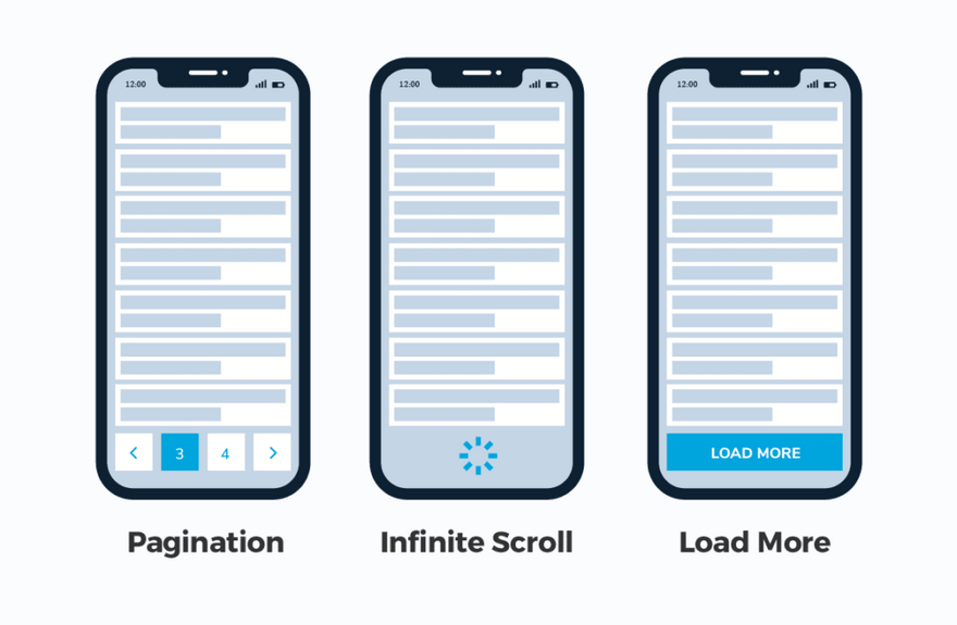
Another factor to keep in mind is Lazy Loading. Lazy Loading is used through things like page numbers and infinite scrolls. By only letting Google open what the user wants to see, you can significantly cut down on load times and make your website faster.
Social media sites have been using infinite scrolling for years and with many users not even reaching the bottom of the screen, why bother when you could be shaving those seconds and server times!
#2. Avoid Content That Jumps Around
Pop-ups, adverts, slow-loading images, cookie disclaimers, and videos are common culprits of CLS — Cumulative Layout Shift. In simple terms, this means how much the content on your page moves around as it loads. In our research, CLS proved to be one of the most difficult Core Web Vital metrics to score well in.
Avoid pop-ups or intrusive adverts on your pages to achieve a better CLS score from Google, and try to minimize interruptions caused by cookie disclaimers or newsletter forms — these are common elements that obscure content.
#3. Think About Your Users First
Mobile websites are often an adaptation of a desktop design, but this isn’t always the most user-friendly layout. Mobile users need large buttons, zero clutter, clear navigation, and even a thumb-based layout that makes it easy to navigate the site using a thumb instead of a mouse. For example, placing the menu or live chat at the bottom of the page, rather than the top.
Don’t forget the CTA too! “Call To Action” buttons are one of the most forgotten elements in many first-time websites. According to web design stats, personalized CTAs in the form of a button convert better than images — 6.5% vs. 2.6%.
Your user will be on the website for something, so it’s best to make that something as bold and easy-to-spot as possible.
Trend #2: User-Generated Content
The Stats Behind the Trend:
- 79% of people say user-generated content highly impacts their purchasing decisions
- 80% of consumers say they’d be more likely to purchase a product from an online store if its website had photos and videos from real customers
- Visitors spend 90% more time on websites that include UGC galleries
What Is It?
User-generated content (UGC) is when customers create content related to your brand – examples include pictures, videos, reviews, testimonials, or even blog posts. You’ll often find user-generated content on social media, making it a great marketing strategy as well as something to consider in your website design.
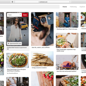
Why Does It Work?
People value authenticity. Nowadays, consumers can sniff out self-promotion no matter how hard you try to conceal it. User-generated content acts as a powerful form of social proof and boosts your brand’s credibility, while placing your customers at the heart of your brand.
A whopping 83% of consumers believe retailers need to provide more authentic shopping experiences, and making room for user-generated content on your website is a perfect way to do that!
How Should You Use It?
#1. Prioritize Reviews
User reviews are a vital part of building customer trust in your store or business. But they can often be left as an after-thought, or hidden at the bottom of product pages. We recommend giving user reviews a greater prominence in your website design to place your users at the heart of your brand.
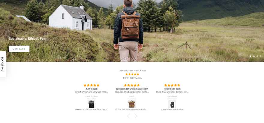
Using reviews can help your users’ decision making process, aid conversions, and show visitors that you engage with and listen to your customers. Customer reviews also help SEO, so you benefit in more ways than one!

#2. Leverage Social Media
Whilst we’re focusing primarily on your website design, we can’t talk about user-generated content without also mentioning social media. Your social channels are the perfect place to encourage, gather, and promote user-generated content and boost your brand awareness.
You can start a competition or hashtag campaign to encourage your followers to buy, interact with, or show off your products. This gives your brand more visibility on social media and creates free, easily searchable content for you to use on your own social channels, website, or marketing.
Of course, once you start featuring more user-generated content on your socials, you can showcase your feeds on your website to keep the ball rolling — and show off all that great content to first-time visitors!
Find Out More
- Check out these User-Generated Content Examples for real-ife inspiration!
Trend #3: Interactive Elements
The Stats Behind the Trend:
- 79% say combining interactive content with other content types improves message retention
- 96% of people who start Buzzfeed quizzes finish them
- Interactive content is a great way to repurpose content — 68% of marketers swear by it
What Is It?
Interactive elements are any part of your website’s design that the user can alter or change. Most of the time, this involves various accessibility features such as dark modes or adjustable font sizes, but recently more “fun” interactive elements such as parallax scrolling, moving text, or mini-sites have been trending. They’re designed to make the website and user experience something to be remembered, building trust and loyalty to the site.
Why Does It Work?
Users want to feel like they have an impact, while also wanting to feel catered for and entertained.
Adding interactive elements such as infographics, animations, quizzes and calculators increases the engagement for users. It makes it feel personalized, and therefore the user can project more of themselves onto the website’s content.
Over 45% of marketers would rate interactive elements as “extremely effective or effective” while 87% of marketers noticed a “measurable lift” from utilizing them.
Additionally, adding accessibility features increases trust in users and can inspire a lot of loyalty in a website. Over 25% of Americans live with a disability, yet many have no options for when they visit a website. Adding simple things for the visually impaired such as adjustable font sizes or a dark mode can vastly improve a user’s online experience and mark your website as one to frequently revisit.
How Should You Use It?
#1. Moving Type
No matter how minimalist your web design, your website is going to have text that your users read. Turns out, even this can be made interactive! Designers this year have been experimenting with how to make text as exciting as possible, with various animations and moving parts.
Only 20% of visitors to a site read the content. Visuals are king, and so having scrolling banners or text that spins has proven to have higher conversion rates, due to its interesting and engaging nature. Interesting content is proven as one of the top three reasons people follow brands on social media.
Find out more: Many of the examples in our list of our favorite weird websites use interactive elements such as text, images, and moving graphics to create their whacky and wonderful web designs!
#2. Quizzes
Quizzes should be your first go-to when adding interactive content to your site. People absolutely love them, they’re easy to make, and they can lead to massive lead generation. According to LeadQuizzes, the average quiz has a 31.6% lead capture rate. Here at Website Builder Guide we even use them to give you the website builder of your dreams!
We’ve talked about Quizzes, but let’s put our money where our mouths are! We employ a number of quizzes designed to match you with your perfect website builder. Try it out today!
Quizzes work because the user has an active choice. They choose the answers, therefore they feel like the answer is personalized to them. This completely bypasses any sense of being marketed to, as the user feels like they’ve found the answer by themselves.
Most quizzes follow a classic structure in order to bring in potential clients:
- The user answers the quiz’s questions
- They see an “Analyzing” screen for a few seconds
- They go to the results page and see an encouraging message like “WOOHOO! Your results are ready!”
- On the results page there will be an option for them to leave their email address
- The user gives you their email and your mailing provider fires an email off to them and you have one more person on your mailing list!
Trend #4: Goodbye Minimalism, Hello Neubrutalism
The Stats Behind the Trend:
- According to website first-impression statistics, 90% of users say that they immediately exit sites with bad web design
- 84.6% of web designers believe crowded web design is the most common mistake made by small businesses
- 38.5% of web designers believe that outdated design is a top reason why visitors leave a website
What Is It?
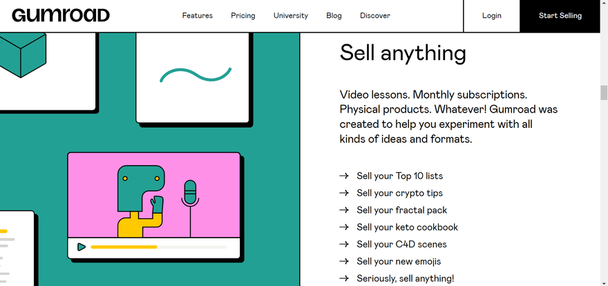
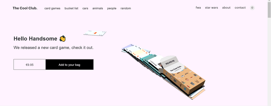
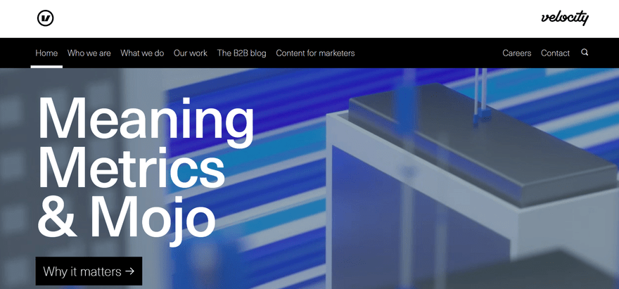
Neubrutalism is a web-design style that combines the corporate-minimalism style with the bolder, more counter-culture Brutalist design style.
The minimalist design of websites has been dominant for over a decade now, and it’s easy to see why. Popularized by Apple during the mid-2000s, the company paved the way for minimal design with plenty of white space that gave an air of futurism and sophistication.
Around 2014 however, “Brutalist” websites began appearing. Designers in the style were trying to replicate the raw, utilitarian design of the landline-internet era. Neubrutalism has emerged as a combination of the two, taking the clean design, consumer-friendly minimalist approach and giving a shot of the grungy, more urban Brutalist style.
Looking for inspiration for your corporate or business site? These examples of Corporate Website Design are a great place to look next!
Why Does It Work?
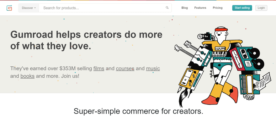
A large part of what makes Neubrutalism work is its high contrast. Much like the original Brutalist architects of the 1950s, Neubrutalism is all about creating something that contrasts the work around it, while also contrasting elements within itself. And it shows in web design too.
Clear hallmarks of the Neubrutalist style are:
- Asymmetrical layout
- Bold, contrasting colors
- Thick shadows
- Quirky fonts
- Illustrations
TOP TIP
When choosing colors, make sure that saturation never reaches above 80%. That’s the key difference between Neubrutalism and regular Brutalism. One is ugly on purpose, the other is adopting the aesthetics of being ugly on purpose.Using Neubrutalism for your website can really show off your personality as a company. When 90.63% of content online gets no traffic from Google, it’s more important than ever that your web design sticks out from the crowd.
How Should You Use It?
#1. Grid-Based Layout
One of the easiest ways to add a flair of Neubrutalism to your site is to adopt a grid-based layout for your site’s navigation.
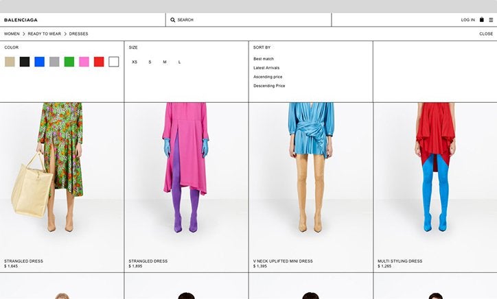
Fashion label Balenciaga has implemented grid-based designs into its site and it makes for a very eye-catching display. Grids are also helpful for mobile UX design. It is much easier to condense the layout of your website to a mobile screen when in a grid formation, as the end rows can be simply added to the columns.
Website builders Wix and Zyro operate through a grid-based design already, enabling you to easily recreate a Neubrutalist website without having to hire a HTML designer. Both these builders come with a range of features at a very reasonable price.
Read our review of Wix here
Read our review of Zyro here
#2. Approachability
Another key facet of Neubrutalism is the approachable nature of its design. We understand that keeping up with Google is a challenge, believe us! There are thousands of articles explaining SEO tricks, marketing strategies and features your website needs in order to consistently hit the top of SERPs.
But those visiting your site will more than likely not appreciate these efforts. The average time spent on websites is only 54 seconds, after all. When users see a meticulously designed site with a hundred different things vying for their attention, it can make them bounce. 34.6% of users said that poor content structure was the reason they left a site immediately.
Neubrutalism’s wonky-yet-deliberate design gives a disarming feeling of “I could do that!”
As Malewicz states, it “normalizes the ugly and makes it easier to approach for beginners… it’s non-threatening and anyone could do it.”
Trend #5: Retro Resurgence
The Stats Behind the Trend:
- Half of consumers believe that brands should prioritize web design
- 94% of first impressions are design related
- 66% of people prefer to look at a beautifully designed website if given 15 minutes to consume content
What Is It?
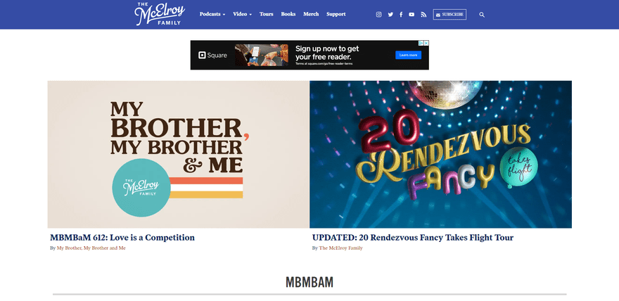
Neubrutalism isn’t the only new design trend getting rolled out. In fact, there seems to be a general consensus that web design (in its current form) has reached a bit of a plateau.
When there’s no clear way forward, many decide to look back!
We can see this occurring with how many “retro aesthetics” seem to be making their way online. Web designers are constantly looking at the 90s, the 80s, the 70s, even all the way back to the 50s for inspiration on how to make their designs feel fresh and new.
Why Does It Work?
Siteify puts the number of websites currently created at 1,169,621,187! That’s 252,000 websites a day and three websites a second!
However, of those sites only 17% are actually active, with the remaining 83% inactive. Not so bad, right? Less competition? Sorry to say, that 17% still accounts for over 200 million!
Online entrepreneurship has always been competitive and oversaturated, because it allows anyone from anywhere to set up a business. In such a market, it’s incredibly hard to find a niche and grow from there. It’s less what you do and more how you do it, and the first step to attracting a consumer base you can grow from is in your design.
Web design as a medium reached the grand old age of 30, which has now allowed people to feel nostalgic for the days of the old internet — much like how millennial cinema audiences do with their reboots of classic 80s properties. “Nostalgia marketing” is a powerful tool, earning millions of dollars every year. In its first year alone, with extremely limited features and hundreds of errors and bugs, Pokemon Go still managed to rake in $558 million dollars from in-app purchases alone. It’s clear that retro design holds lots of potential for users looking for familiar, nostalgic web design.
How Should You Use It?
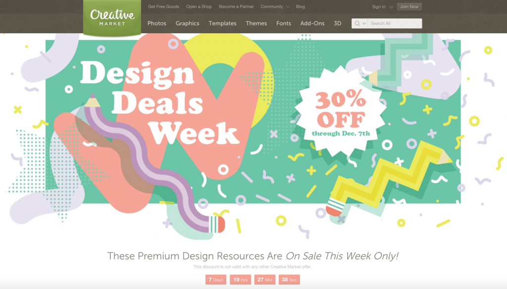
#1. Memphis Style
If you were around for the 80s/90s, you’ve definitely seen this style before! This totally tubular design made big splashes in the design world when it emerged, and it seems to be doing so again, only this time in the world of online websites.
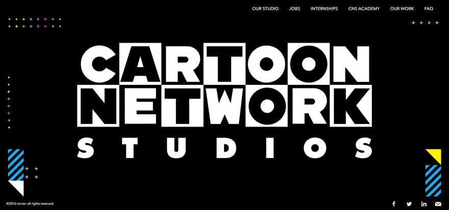
Categorized by its:
- Use of triangles and spheres
- Bright colors with high contrast
- Zig-zags
- Thin, direct lines placed in opposite of free-flowing points
The Memphis Style adds a fun, disarming nature to your website. It puts your website across as one users can trust. We like it so much, we even incorporated some of its aesthetics into our own design!
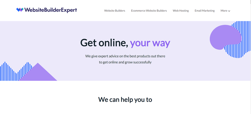
If you’ve built your site with WordPress, there are designer packs Trixie and VicHax that come with Memphis-like designs and font packs. Additionally, keep your eye out for deals with Memphis style templates. Sites like CreativeMarket do them periodically.
#2. Gradients
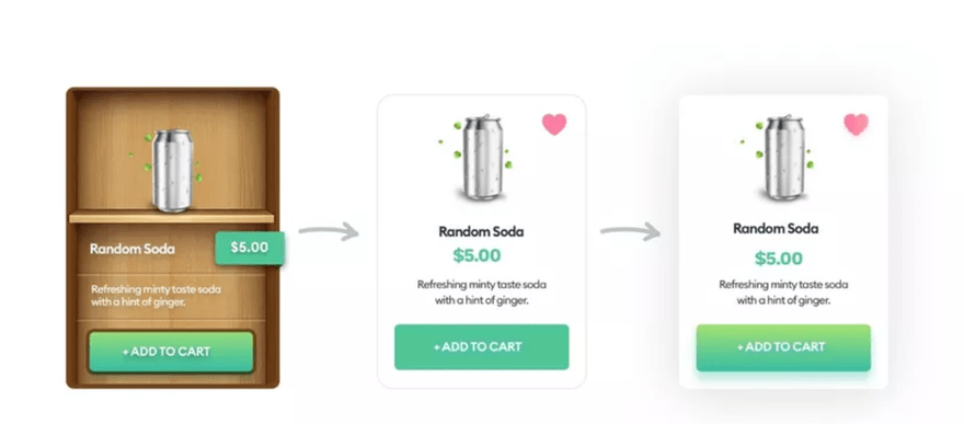
Another easy addition to your website’s design to give it some retro looks would be the reintroduction of gradients to buttons and CTAs. Once all the rage, especially in the early Mobile UX days along with neumorphism, it fell out of fashion around 2013 when more “flat design” and minimalism began taking over. But now it’s coming back in a big way!
Gradients are a versatile way to update your brand’s image without redoing the entire design, and can give your website more of an identity in the meantime. Wix has gradient functions within it, allowing you to remain up-to-date and on the cheap too! For more information about Wix, click here:
Trend #6: Faster Website Load Speeds
The Stats Behind the Trend:
- In a global study, it was found that 27% of all Google searches were voice activated
- 62% of those who regularly use a voice-activated speaker say they are likely to buy something through their voice-activated speaker in the next month.
- The average voice search result page loads in 4.6 seconds (52% faster than the average page).
What Is It?
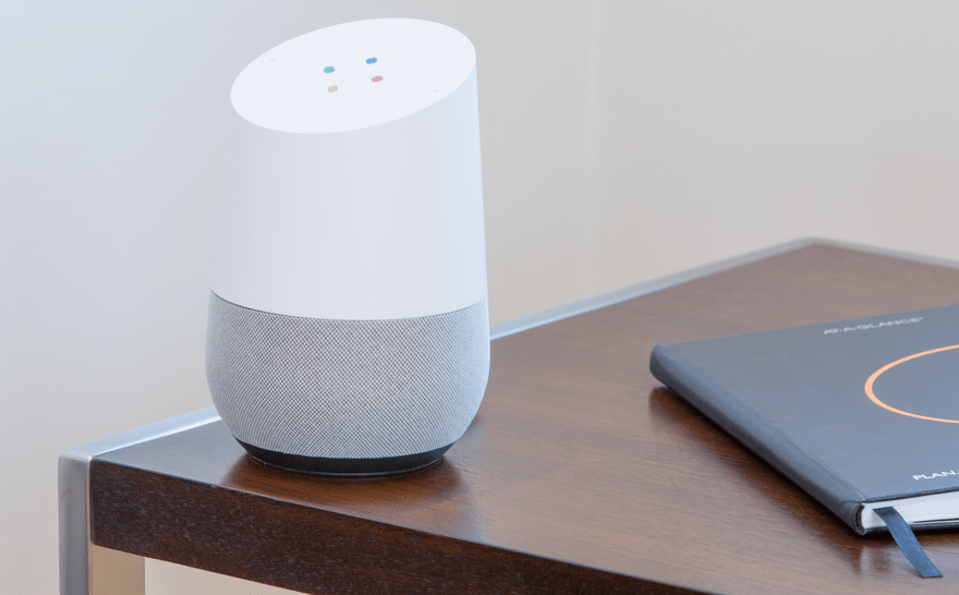
What was initially just a novelty tech demo in 2011 has evolved into a feature many users around the world rely on. For many people, voice searching has broken the barriers of fear in new technology by providing an easy, accessible way to get information online without having to even be near a computer. It’s highly likely that you’ve asked a query on a device through voice, with statistics saying that 72% of US consumers are engaged with digital assistants like Siri, Alexa, Google Home or Cortana.
While voice search has certainly changed how things are done inside the home, what’s less commented on is how it’s affected the wider search landscape. One fifth of all searches in the Google App are now done by voice, and this has ramifications on the search engine results page (or SERP).
If you want your website to be seen, you will have heard of SEO tools and how to rank higher according to Google. Voice searches absolutely need to be considered as part of this when moving forward into the future.
Why Does It Work?
The first major shake-up in voice search SEO is that the way questions are being asked into Google are different.
Google focuses on keywords when creating a results page for search. Previously, people have been able to exploit this by featuring a higher quantity of keywords for specific searches, ensuring their pages were hitting the top of the SERP. Generally, the more words you type into a search, the more specific of an answer you are trying to find.
Voice search does away with this, because now people are asking questions into Google the way they would ask another person. Think about it. You wouldn’t say “best lawn mowers cheap” if you were asking a real person for a recommendation. You would phrase it more like “What are the best lawn mowers that I can get for cheap”.
Voice searches aren’t only more casual either. They’re quicker, easier to carry out and in many ways a lot more convenient than normal searches. By serving your users’ needs, you create a more accessible website than your competitors.
How Should You Use It?
#1. Natural Language
Because Google still marks for keywords, it’s important that when accommodating for voice searches, that all copy features on your site match the search question, including the more natural, conversational language used.
We don’t recommend going fully conversational — you still need to attract the other searches — but adding a more natural style to your copy and answering direct questions should make your result rank higher for voice searches.
TOP TIP
Why not try coming up with a list of questions that someone could ask in which your website is the answer, then shape your website’s copy around answering those questions.#2. Localized Snippets
Another thing to keep in mind about voice searches is that 58% of them are to find information about a local business. To maximize your website’s potential, make sure you know where your consumer base is coming from. Plugins like Localize can translate your site for visitors who speak a different language.
If your website is frequently visited by those in your immediate area, you can cater to them specifically by including short snippets of reviews or info. Include local-only information such as directions, opening hours or even stories from the area. Make sure you update your Google Business account.
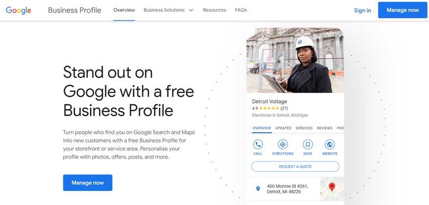
Localized snippets show users that your site is up to date and boosts trust by engaging users with reviews, upfront contact details, and an active online profile. Make sure to formulate these with more natural language and these snippets will soon be hitting the top of SERPs!
Web Trends: Wrap-Up
It has been an exciting year for web design so far. It’s beginning to feel like we are truly in an exciting decade with the amount of new design experimentation and technology being implemented. This the starting point for a whole new era of web design as we finally shed the old and embrace the new in the form of Neubrutalism, voice searches, interactive elements, and the resurgence of retro design factors.
Some things will remain evergreen, however. Mobile isn’t going away anytime soon. If you’re starting a new website, or you want one tip for keeping your current website ahead of the crowd, sticking closely to mobile UX best practices will never be a wasted effort. The same is true of user-generated content. People will always be led by crowds so give users every opportunity to show and share their opinion, and display it fully on your site!
Give your web design the kickstart it deserves this year with one or more of these six web design trends!




1 comment