Explore the Top 12 One Page Website Examples
If you click to purchase a product or service based on our independent recommendations and impartial reviews, we may receive a commission. Learn more
The world of web design never stops evolving. There are so many different types of websites out there, each drawing the user in with beautiful design and fluid movements. One of the most popular trends over the last few years is the one pager – a website featuring everything you need to know on a single page.
One page websites are single-page designs that include all the information within a scrollable layout. This design approach showcases well-crafted, functional, and visually appealing pages that provide a fluid user experience.
Without the need to click through multiple pages to find what they’re looking for, users access information they need all in one space. For this reason, the one page website is an attractive option for many, and there are plenty of website builder templates to help you build your first one-page website.
But which ones are the best, you ask? Prepare to be inspired with 12 one page websites that go above and beyond.
One Page Website Trends
Single page websites offer plenty of advantages. From simplicity to ease of navigation, and an improved user experience, they manage to distill an entire website onto one single page.
They are particularly effective for certain types of businesses like startups, personal portfolios, or small service providers – those that want to get their USP across quickly without asking the browser to do too much.
Current design trends for one page websites include:
- Bold typography and creative fonts. Eye-catching fonts that convey personality and brand identity.
- High-quality custom illustrations. Unique visuals capable of adding character and intrigue.
- Use of micro-interactions. Subtle animations that engage users as they interact with the site.
- Dark mode designs. A sleek and modern appearance that’s easy on the eyes.
- Gradient color schemes. Vibrant and dynamic color transitions that add depth and dimension.
Using some or all of these within your website design will go a long way to engaging users. Trends are always evolving, but these represent what’s hot right now in the world of website building.
12 One Page Website Examples
It’s all well and good knowing what’s trending in web design and what to look out for when using a website builder to craft your own site. But which websites currently stand out from the rest? Here are 12 one-page websites setting the bar for everyone else.
#1 Apple's AirPods Max Page
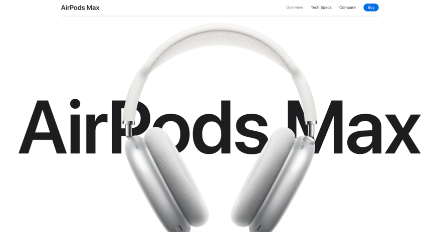
Ok, so technically, Apple has lots of website pages. But it treats each product as a standalone item, which is why Airpods Max has its own web address. And with it, Apple has created a one page website that is a masterclass in product presentation and showcases the headphone’s features, design, and technology.
Apple draws you in with its legendary clean and minimalist design with a white and gray color scheme. Smooth scrolling and interactive animations guide the user, while high-quality images provide a detailed view of the product.
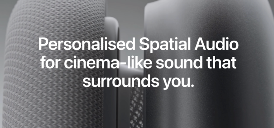
As is always the case with Apple, everything here features a sleek and modern design that aligns with Apple’s brand identity, from the intuitive navigation and interactive elements that enhance user engagement to the storytelling aspects like the videos, animations, and interactive demos showcasing the product’s innovation and functionality.
Apple’s AirPods Max page is a case study in product marketing of a well-designedone-page website. It shows how visual storytelling, as well as interactive elements and a cohesive design come together to create an immersive experience.
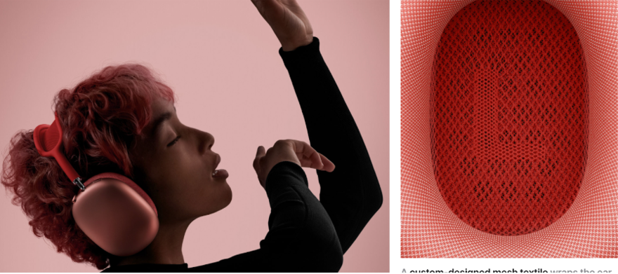
The site serves as an inspiration for how to present a product in a way that not only informs but also engages and excites the viewer.
#2 And Apartments
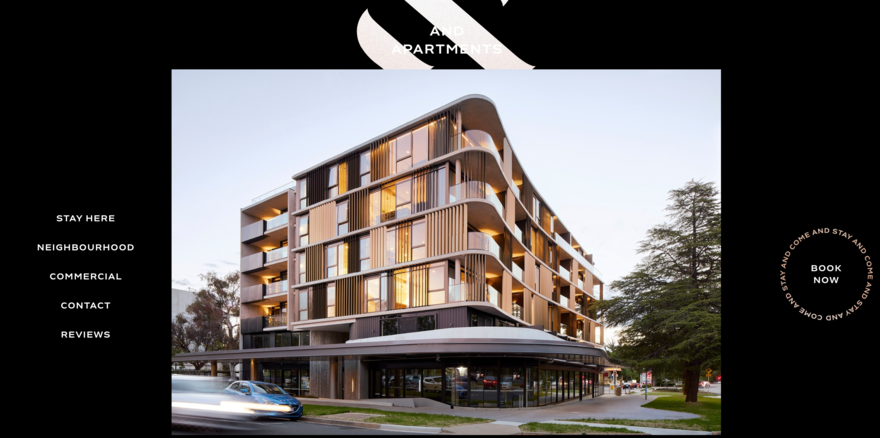
And Apartments’ website showcases luxury living in Canberra’s sought-after Braddon area in Australia. The site uses a modern design that evokes the luxury look and feel of its apartments while highlighting important selling points like eco-friendly extras and luxe furniture.
Visitors easily navigate through the apartment options on offer, with detailed images and descriptions providing drawing you in. Perhaps most importantly, And Apartments always has a CTA at the ready, encouraging visitors to book a stay with a button that sticks to the right-hand side of the website, no matter how much you scroll.
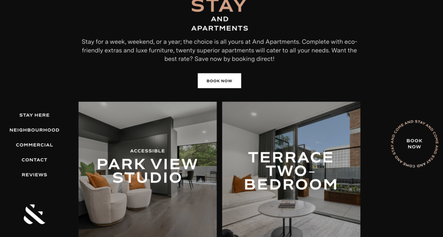
The website effectively builds trust and creates appeal with its clear presentation that serves as an example of how to market luxury products online.
#3 Cook Collective
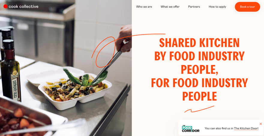
Cook Collective Kitchen has designed a website offering a shared kitchen space in Brooklyn, NY. With 6,500 square feet of space, the company offers eight customizable preparation stations that are fully licensed and equipped for various culinary needs.
It’s a lot of information to convey, and the website does a great job of taking the user through carefully-planned stages so they never feel overwhelmed. The website has a straightforward design that is informative and provides all the need-to-know details, such as shift timings, equipment, services, and partnerships.
Even better, the use of big, bold headings, concise descriptions, and simple color scheme make the site easy to use.

What stands out the most, though, is Cook Collective Kitchen’s community-driven approach – it highlights the importance of collaboration and how users can support each other while growing among like-minded entrepreneurs. It also helps to build trust by highlighting its partners
Cook Collective Kitchen’s website is a fine example of how a business website can be both functional and engaging, catering to specific industry needs.
#4 Gopuff
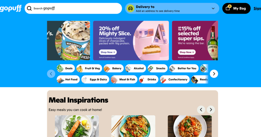
Gopuff’s website is a one-stop destination for food, drinks, home essentials, and much more, delivered right to your doorstep. This is a website with a need to cater to a broad audience. Therefore the design needs to please a wide range of people without ever being too specific.
For this reason, Gopuff’s design is straightforward and user-friendly. The layout is categorized into various sections like fruit & veg, bakery, alcohol, snacks, which allows for easy navigation. Clear images and detailed product descriptions only enhances the shopping experience further.
The grocery home-delivery business is competitive, and Gopuff aims to combat this by making sure that special deals and discounts are prominently displayed across the website. The inclusion of a search function and a simple checkout process further simplifies the user experience.
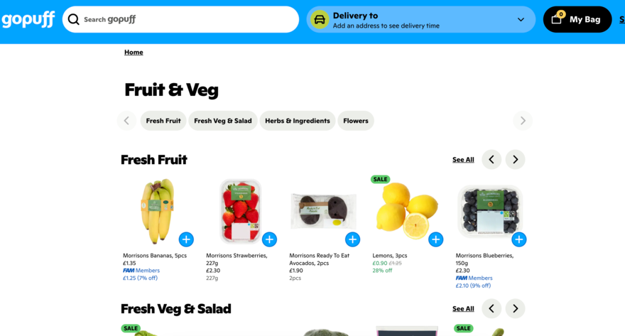
The aim for Gopuff is to help users find products fast, add them to their basket and pay with no fuss. It’s a great example of how to navigate people around your site and ensure they get what they need. It also shows how an e-commerce website can be both functional and engaging to meet the needs of today’s fast-paced lifestyle.
#5 Sanstete
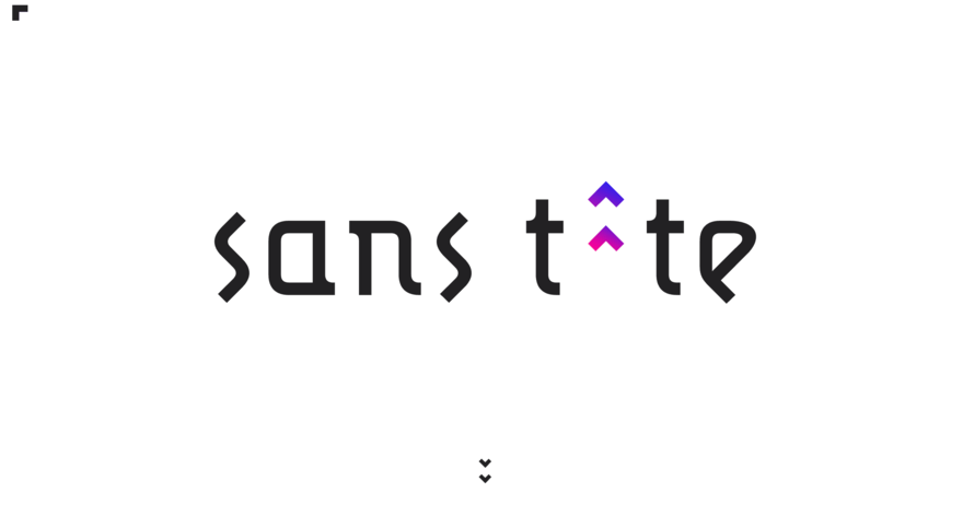
Paris is a city of beautiful design with its striking Haussmann style of architecture. It’s no surprise, then, that Paris-based crowdfunding agency Sanstete channels the city’s style through its own website.
Each section details strategic crowdfunding recommendations, whether it’s financing films or other forms of media. The site’s layout is smart, with sections detailing everything from content strategy to community management.
It’s all done with an aurora of exclusivity, making the user feel like they’re signing up to something special. That’s achieved through the design elements–whether the bold typography and text, monochromatic color scheme, or interactive elements that make browsing seamless–guiding visitors through the services and successful projects.
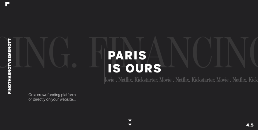
The use of repetitive visual elements also creates a rhythmic flow and Sanstete builds credibility by highlighting its role in various media productions, including films on Netflix.
Sanstete’s website stands out for its clear presentation of services and success stories, reflecting a commitment to creativity and collaboration in the media industry. It’s a great example of how to build a business and create a website that displays a sense of exclusivity through design elements.
#6 Upstate Laundromat
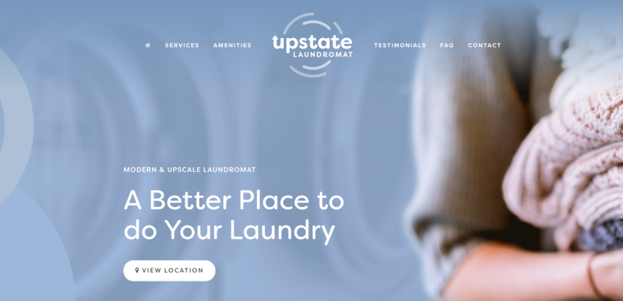
If you’re after a modern and upscale laundromat experience in Greenville, Upstate Laundromat is the option of choice. This small business site boasts a sleek, single page layout, with a header that includes a detailed menu featuring links to amenities, FAQs and testimonials.
A subtle top-bar banner highlights the latest discount offer, while the FAQ section employs a toggle display for efficient space utilization. The site does a great job of showcasing everything, from essentials to nice-to-haves, including the free WiFi while you wait for your laundry, the comfortable seating on offer, charging stations, and on-site attendants.
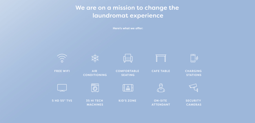
Upstate Laundromat’s website successfully shares its mission to change the laundromat experience, making it a better place to do your laundry. It’s an example of how a well-designed website can effectively represent a business’s values and services.
#7 Hypnax
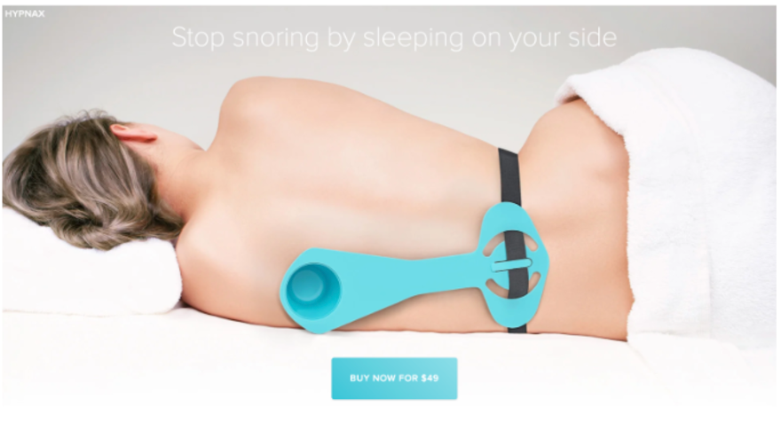
Hypnax’s snore-busting site is a game-changer in the world of sleep. It promotes side-sleeping to help you quit snoring, but with the use of an important device. All of this is communicated through its website, which is a sleek one-pager focused and to the point.
The site flaunts the product’s main features: comfort, simplicity, and rock-solid reliability. Plus, there’s a 30-day cash-back promise and free global shipping that displays the company’s confidence, and it’s all done through a short and snappy website that gets straight to the point.
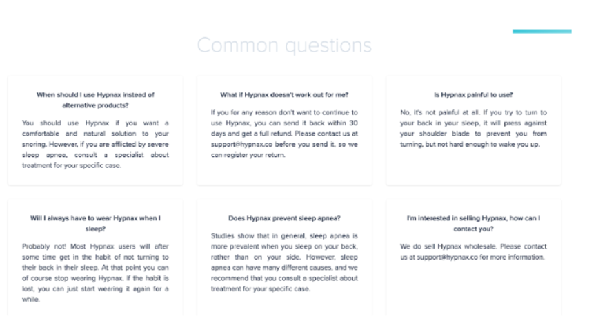
A savvy Q&A goes even more in depth, answering tricky questions to increase shopper confidence and trust. Essentially, Hypnax hits all the right chords with crystal-clear info and a user-friendly approach. It’s a masterclass in how to build a single product website. No fluff, just the facts you need to hit ‘Buy Now!’
#8 Every Last Drop

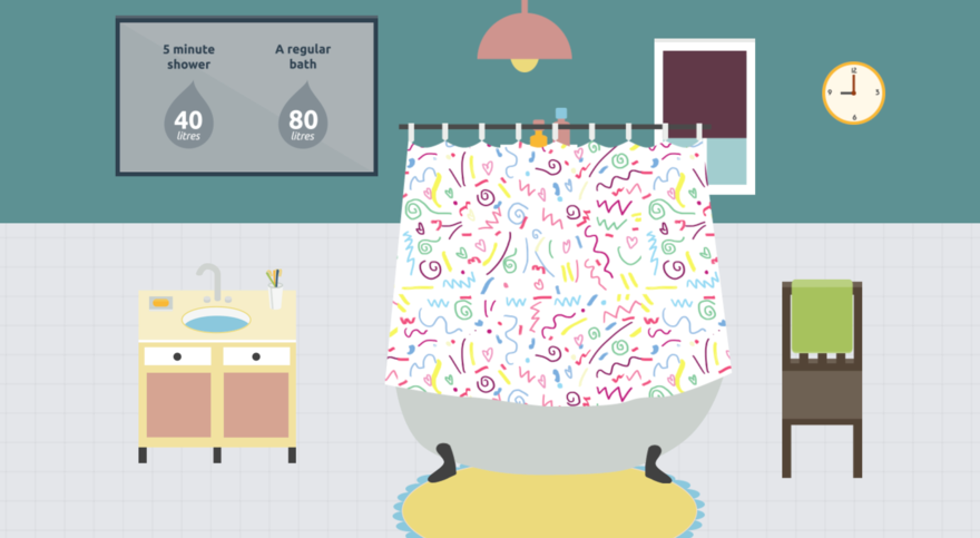
Every Last Drop has created an interactive website focused on water conservation in the UK. It highlights the alarming fact that each person uses around 4,645 liters of water daily, including consumption and production.
The site creatively uses scrolling to guide visitors through statistics and facts, making them fun and engaging in the process. For example, one-third of water is lost through leaky pipes before reaching homes, and the site’s impactful design conveys this with clear visuals and concise text.
Created in partnership with Waterwise and awarded by various design platforms, Every Last Drop’s website is an engaging and educational resource that effectively raises awareness about water conservation. It’s an example of how interactive design can be used to showcase an important message without overcomplicating the topic.
#9 Pixel Lab
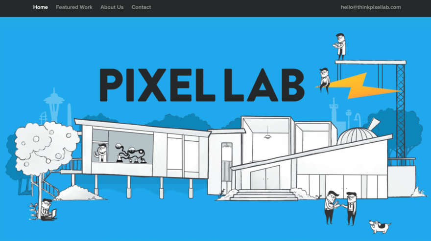
Pixel Lab is an award-winning design and development studio based in Seattle, so it should come as no surprise that its website is on point. The site showcases its expertise through a sleek and engaging website that specializes in creating intuitive experiences for the web and mobile devices.
The company has worked with some big brands and highlights featured work, including projects for Microsoft, Red Bull, and Honda. This builds authority and increases trust in the brand.
Like Every Last Drop, the design focuses on animation to help the website flow. The easy navigation lets you explore successful projects while an FAQ section provides insight into areas of expertise, project size preferences, and openness to new projects.
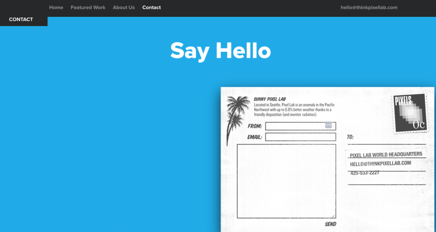
There’s a friendly tone across the site, as well as a clear presentation of its achievements to make it an inviting platform for potential clients. Pixel Lab’s website stands out because of its commitment to quality design and development, conveying its capabilities and inviting collaboration effectively.
#10 Sprint Report
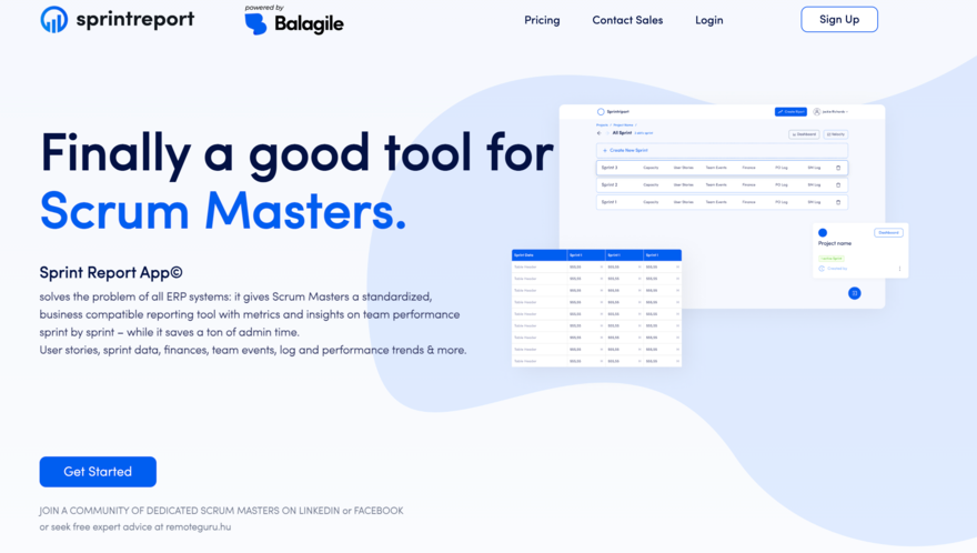
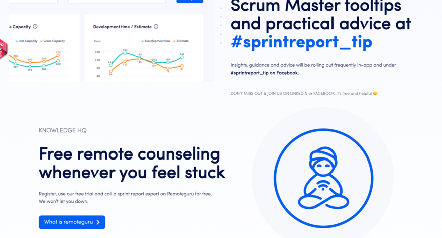
Sprint Report is finally a good tool for scrum masters. At least that’s what it bills itself as. One thing’s for sure – its one page website’s minimalist design allows for easy navigation, with important features like transparent data synchronization and frequently updated tooltips for Scrum Masters highlighted throughout.
Sprint Report’s website stands out as a valuable resource for scrum masters. It’s easy to look at, and metric-based, aligning with the needs of project management and team collaboration. Think of it as an example of how a niche product can be effectively presented to its target audience.
#11 We Ain't Plastic
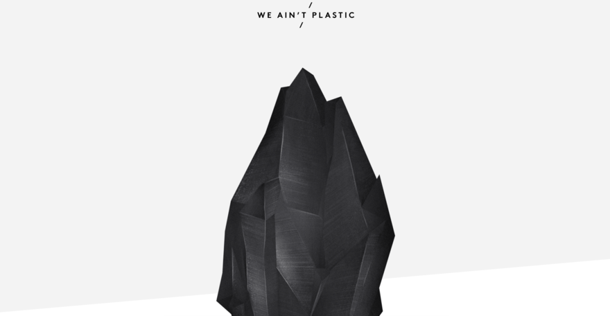
We Ain’t Plastic is the digital portfolio of Roland Lösslein, a Creative Technologist & User Experience Engineer based in Berlin. This single page website showcases his extensive experience in creating digital products, ranging from product design to user experience development and delivery.
The design is ultra clean and image-led, so your focus is drawn to the highlights of his work with well-known brands. Users also get insights into Roland’s workflow, tools, and strategies, as well as his thoughts on UX design and development, which features prototypes and interaction patterns.
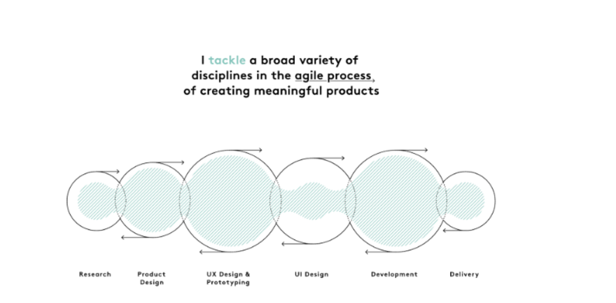
Roland’s site showcases his unique strategic mindset and user-focused philosophy. We Ain’t Plastic serves as a vivid display of his design and tech prowess. It’s a standout example of a website that’s about the individual and not just the business.
#12 Garden Studio
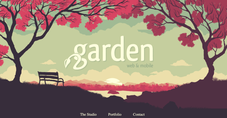
Garden Studio’s vivid design immediately captures user attention. As a digital studio crafting designs for clients, the website mirrors its proficiency in interactive, clean design. From the eye-catching visuals to the user-friendly layout, this one page site effectively displays its capabilities in a compelling and informative manner.
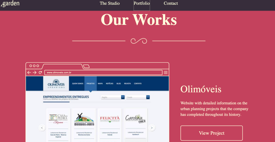
Navigating this website is smooth – the design layout ensures you can effortlessly locate what you’re looking for, be it details about Garden Studio’s offerings or samples of their prior work simply by scrolling.
Summary: One Page Wonders
One page websites provide a sleek, captivating method for showcasing content. Their straightforwardness, effortless navigation, and cutting-edge design elements render them an attractive option if you’re seeking ideas to distinguish your one-page site from rivals.


Leave a comment