Asymmetrical Balance: What Is It and How to Use It in Your Website?
If you click to purchase a product or service based on our independent recommendations and impartial reviews, we may receive a commission. Learn more
When it comes to branding and marketing, design is everything. From the world’s most recognizable logos such as Apple and McDonald’s to the world’s most recognizable websites such as Amazon – skill, time, and effort goes into creating all the designs we know and love.
In this guide, we walk you through asymmetrical balance. This tool could totally change how you look at and plan your web design.
What Is Asymmetrical Balance?
Although it may sound complex, the concept of asymmetrical balance isn’t all that tricky to get your head around. It is a powerful design tool that can be used to make a greater impact on your web design from branding and logos to company websites and social media posts.
The concept of asymmetrical balance relies on an unequal visual weight on each side of a composition. For example, if you cut an asymmetrical design in half down the middle, one side would contain a dominant element, while the other would use lesser focal points in order to balance it out and add weight to the dominant element.
Asymmetrical Vs Symmetrical Balance
Symmetrical balance is (perhaps unsurprisingly) the opposite of asymmetrical balance. Where asymmetrical balance will use uneven symmetry in order to make a visual impact, using a symmetrical approach will see a design using perfect or near-perfect symmetry in order to develop a visually pleasing experience.
Whether you use an asymmetrical or symmetrical design will depend on what you are trying to achieve.
Asymmetrical balance allows you to create designs that offer a sense of balance yet also use unequal visual weighting in order to evoke a sense of movement and modernism. On the other hand, symmetrical balance uses two identical sides with perfectly equal weight in order to develop a feeling of structure and formality.
Benefits of Using Asymmetrical Balance
As we have mentioned before, asymmetrical balance can be a powerful tool in design. But this is only the case when you know when and where to use it in order to achieve the desired impact.
Asymmetrical balance can help you create a more casual impact in your designs. This is especially beneficial for modern businesses that are leaning toward a more personable and relatable brand to their customers. For example, a start-up that’s targeting customers in the 18-35 age range would likely benefit from using asymmetrical balance in its branding and website to highlight its younger, more edgy vibe.
Asymmetrical balance can also help you develop more intricate and complicated designs. Where symmetrical design is restricted by ensuring that one design is reflected and repeated, asymmetrically balanced designs open the doors to developing any level of detail you want without the need to reflect that design elsewhere.
So, you can use this type of design to catch attention, develop interest, set a tone of informality, and even provoke emotions such as awe or tension. This makes it a powerful tool to use in marketing materials, especially on websites.
With an imbalance in design, asymmetry can also be used to highlight an important element. For example, you may use a large image of your product in contrast to smaller, contrasting elements in order to bring attention to it and develop a greater impact.
Asymmetrical Balance Website Examples
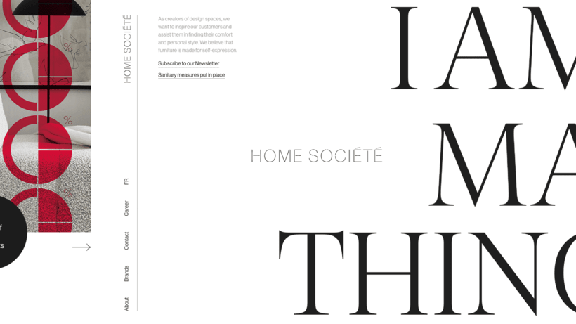
Home Societe

This website uses an asymmetrical design to give itself a fresh and modern feel. Using bold text and sparse color helps to guide your eye across the page and creates a highly pleasing visual impact. The site also uses an unusual menu position which forces you to take in the whole design before selecting where to navigate next.
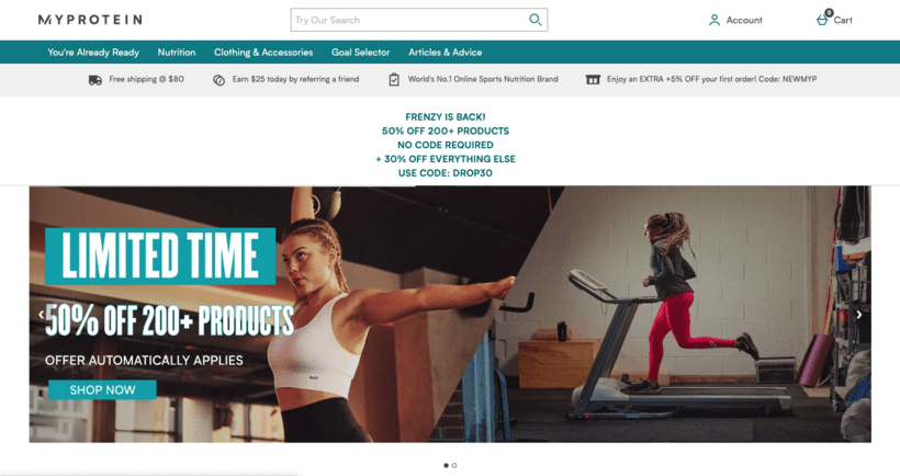
MyProtein

MyProtein uses an asymmetrical image on its homepage design in order to generate intrigue and draw your eye. This approach pushes visitors to read the key message “Limited Time,” while developing brand recognition with fitness-themed imagery.
Social Media Examiner

The Social Media Examiner website uses asymmetrical balance to great effect. They use this design tool in order to push the elements of their website which are most important to them. For example, you can see within the example above how those key elements such as the call to action “Improve Your Marketing” and their email sign-up form catch your eye.
Asymmetrical Balance Top Tips
Use a Focal Point
A focal point is a specific point within your design that captures and draws in the viewer’s eye. Asymmetrically balanced design is beneficial because it makes it easier to create a focal point. In turn, this makes it easier to highlight the most important aspect, such as a product image or a key piece of text.
By varying the various elements of your design (such as their size, color, and texture) you can help create a powerful focal point. Typically, the goal when creating a focal point is to use the background to help make the foreground stand out from the rest of the design.
Contrast With Colors
While symmetrical balance will help you create a design that captures the attention of the viewer as a whole, asymmetrical balance allows you to contrast the design and guide the viewer’s eye to a specific point or points.
Contrasting colors can be used to achieve this. For example, in your color scheme you may combine the use of purple and yellow, blue and orange, or red and green to make certain elements of your design really stand out from the page (or screen). You can also use varying shades (lighter and darker versions of color) to enhance this effect.
Carefully Consider White Space
Talk to any quality designer and they will tell you that white space is an incredibly important aspect of design to consider.
Often it is the things that go unsaid that have the most meaning, the same can be said for white space. Using it in your asymmetrically balanced design can help you add additional weight to the spaces where you do use other elements.
Take the famous iPod ad for example (shown below). The heavy use of white space in this advertisement really makes the elements they do use stand out – the design of the device the and hard-hitting statements about its capability.

Balanced Asymmetry: Summary
It’s clear that asymmetrical balance is a useful and powerful tool for businesses to use in their marketing and branding. This is especially true for businesses that want to take a step away from traditional symmetrical designs and create a more modern, fun, and youthful feel to their branding.


Leave a comment