8 Top Splash Page Examples
If you click to purchase a product or service based on our independent recommendations and impartial reviews, we may receive a commission. Learn more
We all like to make a good first impression, whether in-person or on our website.
Sometimes making a good first impression is about getting someone’s attention fast with something that’s interesting or useful. When done right, website splash pages can do just that.
But you might not be familiar with the term “splash page” or how to use them to your advantage for your online store. Website Builder Guide is here to take you through what they are, what advantages they bring, and plenty of splash page examples to show you all the potential.
What Is a Splash Page?
Splash pages are temporary pages that your audience sees before they see your landing page. They’re generally used for promotions, announcements, campaigns, user differentiation, or sign-up drives.
A splash page is not a pop-up. Though they look alike and can be used in similar ways, a pop-up requires the user to do something first (like scroll, try to exit the website, etc.) to trigger the pop-up. Whereas everyone who visits your website will get the splash page.
But how do you know if splash pages are right for your website? It depends on how you want to connect with your audience. Splash pages can bring benefits to your website including:
Announcing a promotion or service – Your audience might have a limited knowledge of who you are and what products/services you offer. When you have something new to promote, or a branch of service or products people don’t know about, a splash page can let people know you’ve got a lot more to offer.
Age verification – These are popular on alcohol and any age-restrictive website. They act like a virtual bouncer (without the bowtie) allowing the customer to verify their age and enter the portal of a website.
To boost conversions – The average conversion rate for a regular landing page is 9.7% so there’s plenty of room for improvement. A clever splash page with a clear call to action can boost sales, email lists, and website hang time.
To plain old entertain – Sometimes, particularly if your website is very visual, it’s nice to include a new bit of content that will delight your audience. An animation clip, a funny joke, customers reacting to a new product – they can put a smile on your audience’s face before they’ve even seen your proper website.
Customize the UX – Different website users bring their own interests and intentions to your website. Splash pages can allow a user to choose language, country, even their job title or what they’re looking for, and be directed down a funnel that’s meant just for them.
Advice from the Experts
TopTip: Splash pages can also be irritating. Make sure yours loads fast, and has a clear purpose or goal.
Best Splash Page Examples
Website splash page examples show the potential of splash pages. They can inspire some thought into how they can work best for you.
Here are some of the best examples of website splash pages. But note – because splash pages change all the time, the links might offer a completely different splash page by the time you visit. But that’s a good thing!
#1. McDonalds
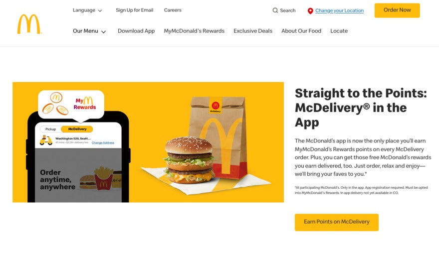
Here’s what we love about one of the most universal brands in the world – lots of people don’t think about delivery when they think of McDonald’s because for decades, we’ve been in-person and drive-through customers.
This splash page uses all the best McDonald’s colors and text, and promises that the delivery app brings McDonalds right to you. It’s branding on steroids.
#2. Natty Boh
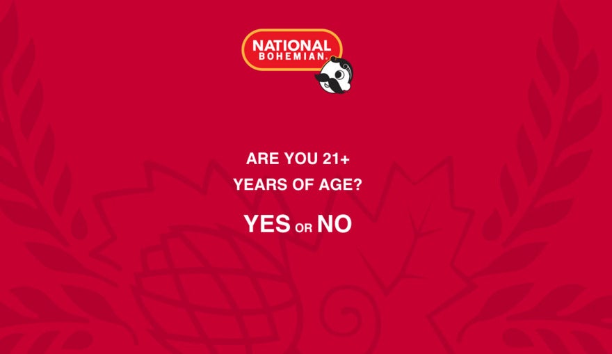
National Bohemian is a Baltimore-based institution. Any tv show based in Baltimore (including The Wire and Homicide) includes it. And just like any website that sells booze, booze memorabilia, or gives info about the booze brand, it should only allow users who are above 21 years old.
A splash page that requires the user to enter their age is a gatekeeping tactic, and though it’s not foolproof it’s a way to create community and show you’re making an effort. We love Natty Boh’s page because it’s simple, and uses Natty Boh’s famous color scheme and mascot which fans will recognise immediately.
Advice from the Experts
Top Tip: A splash page should be temporary, no matter how good it is. Change it up, as often as possible.
#3. Cardi B
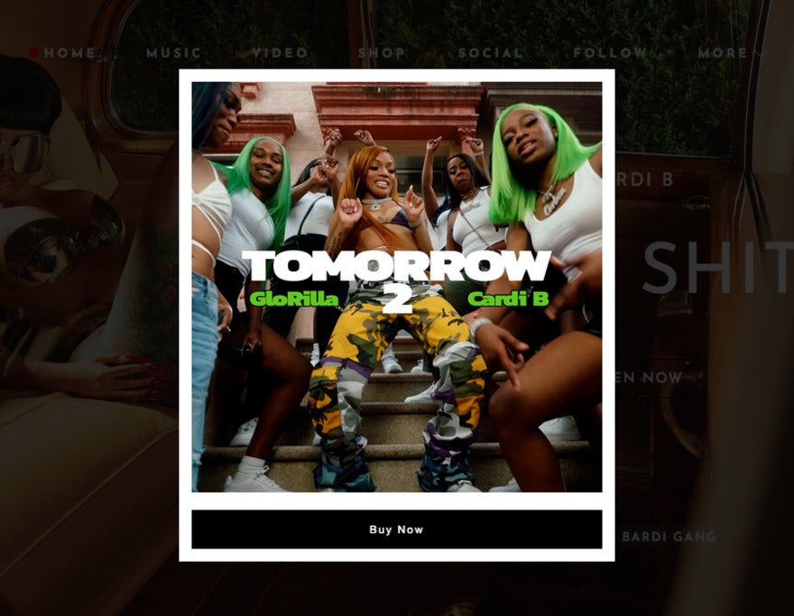
Sometimes it really is about getting the audience excited about something, and Cardi B has the magic touch. Fans have been waiting for a new album for a while, and this splash page provides a countdown to build excitement and inspires fans to come back over and over.
The image is killer and it grabs attention in a sentence or two. It leads to a definite end with a clear call to convert (get the album!) You can do the same for your online business idea – build the anticipation with a rolling counter, and get people excited about your newest venture.
#4. Zara
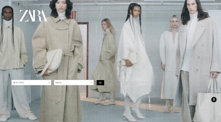
Zara’s an international fashion brand recognized by millions of people around the world. Zara’s popularity is exactly why its splash page has a very specific function – to allow the user to choose which country they’re in.
It’s a way to personalize the user experience according to language, localized trends and tastes, and currency. It’s also a way for those of us in one country to check out what’s available in another country. We also love that Zara always chooses a bold, memorable visual.
#5. Skyline Drive-In
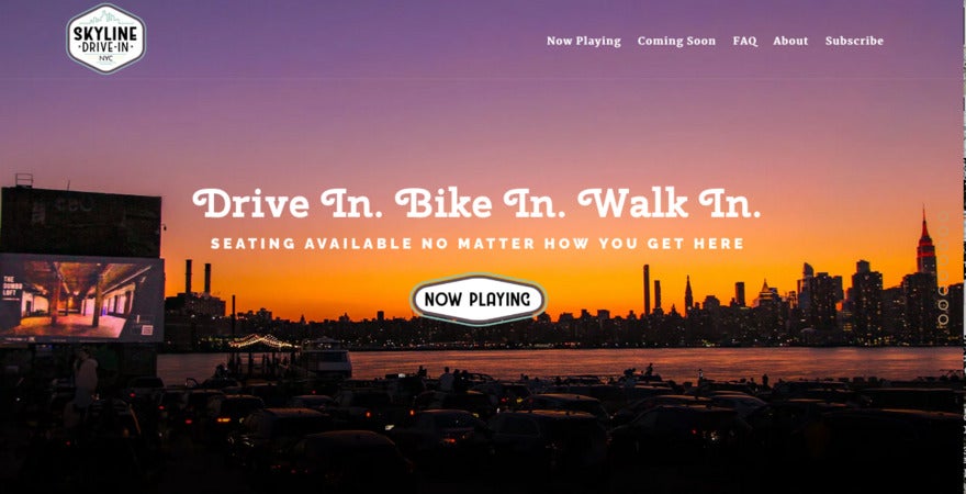
While sadly many drive-ins have gone out of business, we can’t help but love them. And this splash page example from Skyline Drive-In is particularly cool.
Skyline’s splash page really sells its brand. Not only is it a cool service, in a cool location, but it’s clever. It’s a transparent page which allows the amazing visual underneath to shine through. This makes sense because it’s the view they’re selling to the audience – so this is a preview to the coming attraction! Pass the popcorn please.
Advice from the Experts
Top Tip: Remember, splash pages have to be optimized differently for a cell phone vs. desktop/laptop.
#6. Hubspot
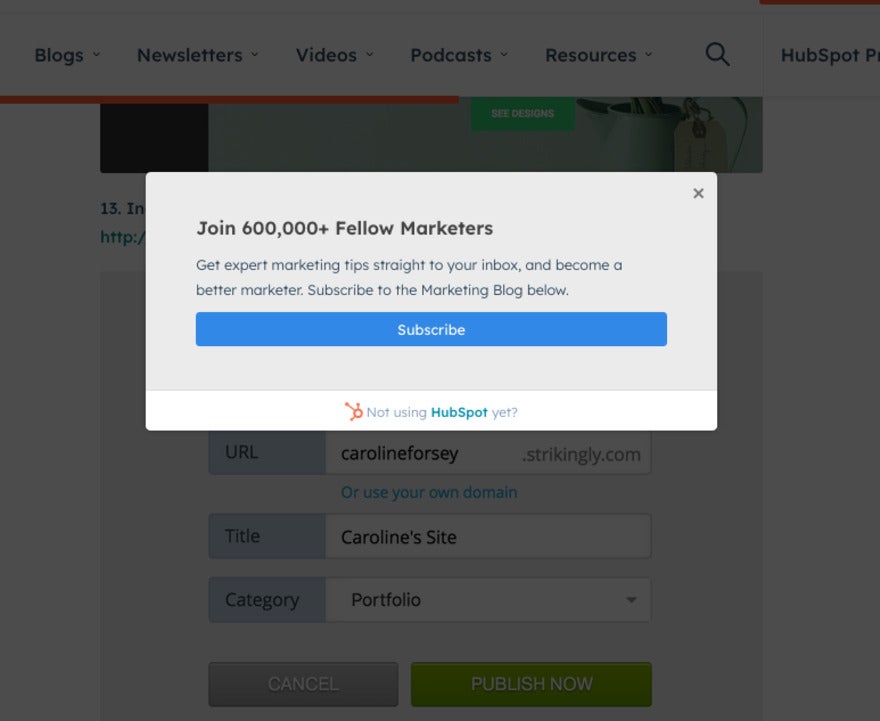
Sometimes simplicity is best – especially if your audience is in a low-bandwidth location. Hubspot has a simple splash page with a clear call to action that asks for a visitor to sign up.
It promises clear benefits, points toward a community, and capitalizes on FOMO too. It covers everything that’s important and makes sure the user knows they have nothing to lose by trying!
#7. Auntie Anne’s
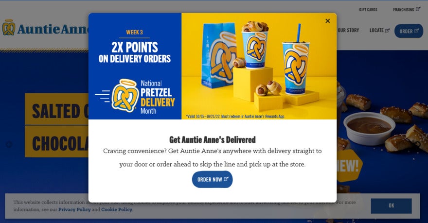
Okay, we are huge fans of Auntie Anne’s. It’s not just because of the jalapeño cheese dip. What makes this splash page so good is that it looks simple, but gets a lot of different things done.
Along with the exciting content scrolling underneath, this splash page example makes the user aware of the delivery service and the fact you get double points if you go with the delivery. It also loads fast – this is very important for a splash page. You don’t want your audience to bounce within a second of landing on your website.
#8. American Recycled Clothing
We all love a bit of clothing sustainability and recycling. It’s not only very good for the earth, but it allows us to rock completely unique pieces and cater to our individual style.
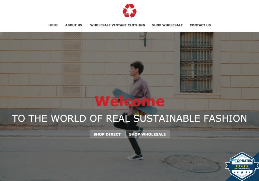
American Recycled Clothing’s live-action splash page differentiates between retail and wholesale users, which makes sense because a business will have different intentions to a retail customer who is browsing. So this splash page example provides a very specific user journey with its own funnel and language to guide them. It’s a great example of differentiating your audience.
Summary
Website splash pages can be the “hello” greeting from your online store to your customer. That’s why it’s important to get them right so that you can engage your audience and grab their attention immediately. These website splash page examples show what you can do with a good splash page, and have hopefully inspired you to create or update your own splash page. Let us know how you get on in the comments below!


Leave a comment