10 Best Doctor Website Designs
If you click to purchase a product or service based on our independent recommendations and impartial reviews, we may receive a commission. Learn more
Doctors are busy professionals who work hard to make the world a better place. In fact, they are often so busy that they have little time to think about their online presence. Yet great doctors can draw huge benefits from having a well-designed and easy-to-navigate website, and luckily starting a website is now quicker than ever thanks to website builders and website templates.
In this article, we explore doctors’ websites. We run you through exactly why this digital tool is so important to doctors and why getting the design right is crucial to success. Then, we’ll take a look at 10 of the best doctor website designs out there, to help inspire you and get your creative juices flowing.
Why Do Doctors Need a Website?
Whether you run an established practice or you’re just starting out, a great website can be highly beneficial for doctors.
For new or growing practices a website can be a great way to reach new customers. For example, a well-designed website will usually perform well on search engines. This makes it easy for local customers to find and connect with you.
A great site will also help you convince those customers that you’re the right option for them, offering them information on who you are, what you offer, and how you can benefit them.
Websites can even be useful for doctors that aren’t necessarily looking to grow their practices. In this case, a website is a helpful tool, allowing you to streamline processes such as appointment booking and helping customers find answers to common questions they may have.
Plus, building a website doesn’t need to be difficult or time-consuming. Using a website builder like Wix or Squarespace can help you get your site online in a couple of hours.
Why Does Website Design Matter?
So, websites for doctors are important, but why does their design matter?
There are several reasons why you should take the time to consider your website template design. Firstly, great design makes it easier for patients to navigate, and this speeds up the process of customer onboarding, limiting potential visitor frustration.
Great design is also crucial for establishing authority. As customers need to have a level of trust in the doctor they use, building trust in your website is essential to long-term success.
Finally, many design best practices can also help you rank better on search engine result pages. This will make it easier for potential customers to find you.
10 Best Doctor Website Designs
1. Dr Frank McCormick MD, Orthopedic Surgeon
WordPress

This great website from Dr. McCormick offers a solid example of an engaging, easy-to-navigate website. The use of bold colors really makes this design stand out. The use of professional images of Dr. McComick also helps to establish an element of trust.
Notice how the most important parts of the website (contact options) really pop off the page, making it clear to visitors what they should do when they want to take the next step.
To make this website better, we would recommend limiting the number of menu options to avoid confusion. The use of generic imagery could also be swapped to make this site more personalized.
2. Peds on Wheels
Wix

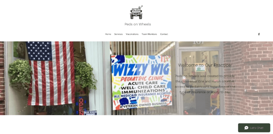
Peds on Wheels have opted for a one-page website, which is ideal for businesses trying to keep things as simple as possible. By simply clicking the top menu, you are directed to the part of the page that has the information you are looking for this. This approach is certainly something you should consider for your own doctor’s website if you don’t want to overcomplicate things.
The ‘Let’s Chat’ function also lets visitors easily reach out with any additional questions they may have.
Including the ability to book appointments would make this doctor’s website design perfect.
3. SkinPharm
Shopify

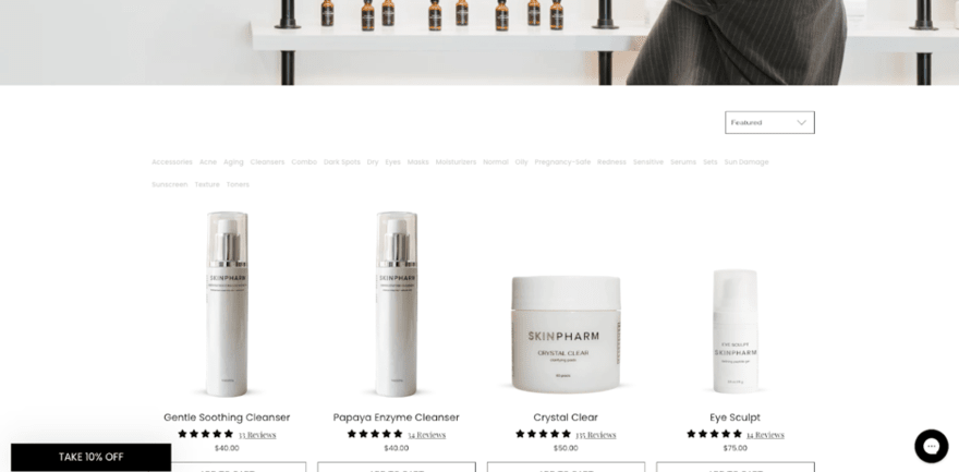
This website by SkinPharm is built on Shopify and takes medical websites to the next level. This site has fully embraced the online space and even takes advantage of Shopify’s advanced ecommerce functions.
The homepage design perfectly balances simplicity with beautiful images. It also includes two key calls to action, directing visitors to the areas of the site where they can book into the clinic or buy products directly.
This website is a great example and there is very little we would change to make it better.
4. Truecare
WordPress

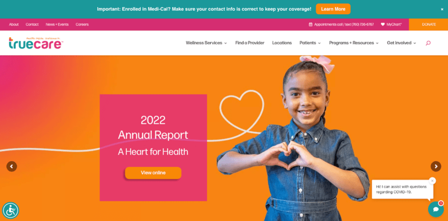
Bold and bright, this website by Truecare is another brilliant example of an inspirational doctor’s website.
Note the use of color on this website. It really makes the key elements stand out from the page. This can be applied to your own website but should be done with care as too much color or the wrong use of colors can make the contents of the page look messy and hard to navigate.
5. Posturefixx
WordPress

Modern and striking, this design by Posturefixx really makes a visual impact. What we love about this site is how simple it is. There are just a few menu options to select from and a clear call to action in the top right corner, making the next steps easy. Try this on your own site – limiting clickable menu options to only the most essential.
The use of an online chat also makes it really easy for you to provide great online customer service, to help customers get their questions answered quickly.
6. Amanda’s Family Medicine
Wix

This website for Amanda’s Family Medicine is a fantastic example of how simple a doctor’s website can be. This is an ideal design for those who want to create a calm, yet professional feeling around their website. The use of a single topical image is a great way to pull attention to the most important parts of the page.
The inclusion of a ‘Meet the Team’ page (like that pictured) can help really add a personal element to your website. However, we would recommend adding more information and images to make the page stand out.
7. Dr Christopher Wakely
Squarespace

Dr Christopher Wakely’s website is a stunning example, showing a clean design which has a big impact.
One thing that really stands out about this design is the clear call to action, emphasised by the white space surrounding it in the top right corner.
When designing your own website it can pay dividends to consider what’s most important to you. Do you want more sign-ups? More calls? An increase in email enquiries? Make sure to include plenty of prominent calls to action that center around that goal and are easy for your users to find – just like this example.
8. Dr Jennifer Kong
WordPress

This website from Dr Jennifer Kong keeps things simple and to the point. Using just three options in the menu with further drop-downs makes it easy for customers to navigate, one way of following navigation best practices. This can limit customer frustration and make it less likely that visitors will bounce away from the site.
Like in this example, consider adding a map to your doctor’s website. This will help customers better understand where you are in relation to their own location and add an element of familiarity for those who are from the local area.
9. Eastside Integrative Medicine
Squarespace

This stunning design for Eastside Integrative Medicine uses a calming color palette to put visitors at ease. This is something you should consider for your own website, as it can help put apprehensive visitors at ease.
Again, we see the use of personal imagery to add an element of trust and integrity to this site. It’s also easy to navigate, helping visitors find everything they need in just a few clicks.
10. Pinnacle
WordPress

Built on WordPress, this website from Pinnacle Health Care is a great example of how to use white space alongside bright colors for maximum impact.
This site offers a lot, with a menu consisting of nine options. This may be a little too much and may confuse your visitors, so limiting menu options and other homepage links can be worthwhile.
Best Doctor Website Design: Summary
Websites are an important tool for doctors. Whether you are an established doctor with a full schedule, or you’re just starting your own practice, a website will help you reach new customers and communicate essential information about who you are and what you have to offer.
Our design examples in this guide show us that simplicity is key. We can also see that doctors should aim for designs that help them establish authority and trustworthiness, as this will help them generate the trust required to onboard new customers.
To get a design that truly represents your expertise, you may even consider hiring a professional website designer. However, if you want to build your website yourself, we hope the examples above have given you plenty of inspiration and ideas to help build the perfect doctor’s website.
Once you’ve designed your site, check out our guide on marketing for doctors to reach more people with your site.


Leave a comment