A Case for Clunky, Utilitarian Web Design
If you click to purchase a product or service based on our independent recommendations and impartial reviews, we may receive a commission. Learn more

There are tried and true standards for the best-designed websites, and their status is well-earned. Clean, minimalist, intuitive websites dot their i’s and cross their t’s, but they’re not the only way. There is a place for clunky, for labyrinthian, for the baffling and bizarre. It’s easier to get wrong, but sometimes the best thing a site can do is ask you to play with it.
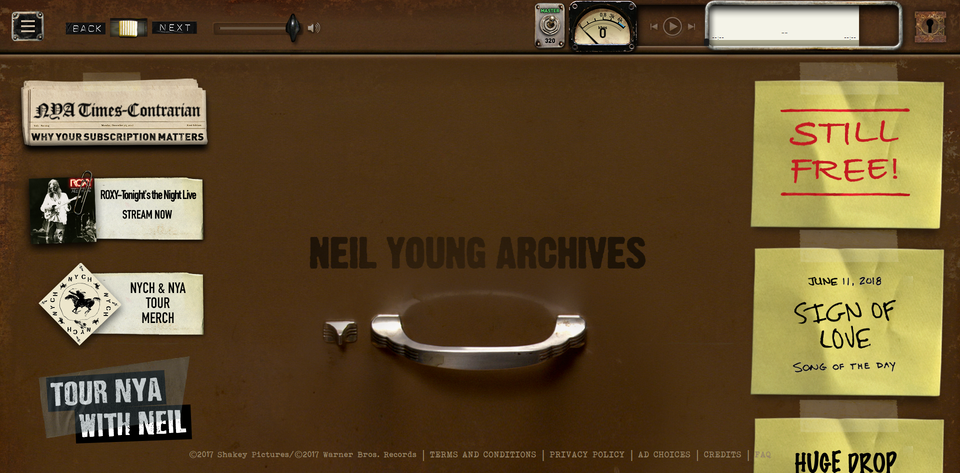
I recently had the pleasure of browsing the Neil Young Archives (NYA) website, a new online resource for everything Neil Young. “A giant time machine cabinet,” as Young puts it. Albums and tracks, bits and pieces, manuscripts and art, film and video, and web design that flies in the face of conventional wisdom.
Grainy is the New Sexy
The Neil Young Archives are a lot to get your head around. Land on the homepage and you’re met with knobs, dials, sticky notes, a keyhole; all sorts of things you’re unlikely to find in popular website templates. It’s strange, and it isn’t obvious where to go or what to do. Instead you’re invited to play with the site, to learn its rules.
It’s a utilitarian model. The purpose of the NYA is to provide a centralized resource for everything Neil Young, from demos to photographs. The site is built around that purpose. It has an aesthetic, but appearances are clearly a secondary concern.
Sites with clear value can sometimes afford to ask for patience from its users. The NYA is, as Michael Hann of The Guardian puts it, “like one of the first wave of box sets expanded to its logical extreme, but still – despite its huge breadth – manageable in a way that the 18 CDs of Dylan’s The Cutting Edge just weren’t.”
Usefulness Never Goes out of Fashion
Beauty is as much a product of function as it is of appearance, perhaps more so in web design. Fashionable is good, but it is also temporary. A wow-factor site today is lost in the crowd tomorrow. A useful site today will retain users for as long as it continues to be useful, even if it’s somewhere near Quasimodo on the attractiveness scale.
76 percent of browsers say the most important factor for them in a website’s design is it “makes it easy for me to find what I want.” You know how many said appearance was the most important thing? 5 percent. Know what your users want to find and make it as simple as possible for them to do so. For some, all that requires is clear ‘About’ and ‘Shop’ options in the navigation bar. For others, that means something a bit messier.
Pro-function Brutalism
‘What people want to find’ is a big tent. People want to find all sorts of things; information, inspiration, products, tools, services, skills. The list goes on and on. Oftentimes that does require a website to be clean and sexy, but certainly not always.
Visitors to the Neil Young Archives want to find a place to get lost, to discover music and the stories behind that music. It’s possible for a giant time machine cabinet to be restrained and minimalist, but I can’t imagine it would be appropriate.
Forums are another good example of the value of utilitarian design. Reddit, one of the largest sites in the world, didn’t change its design for a decade. It got on just fine. Amazon doesn’t waste time with niceties. They sell things. Land on their site, there’s things everywhere. Find the thing, click on the thing, buy the thing. Marvelous.
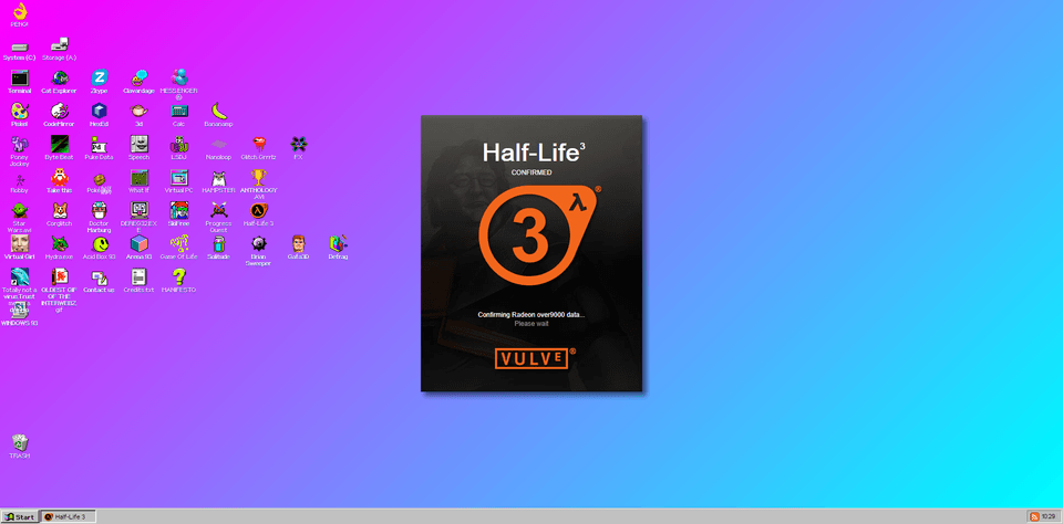
David Lee, the chief creative officer of Squarespace, says he has seen in increase in “anti-design brutalism” in recent years, sites that are deliberately jarring and difficult to browse. That’s not what I’m talking about here, but it is unquestionably part of the same tonal shift. The natural cousin of anti-design brutalism is pro-function brutalism. The rise of throwback sites like Neocities show as much.
Know Thyself
Utilitarian design can be a disaster. It isn’t always appropriate. There is not a one-size-fits-all solution to web design, but as Candace Jackson wrote for The New York Times last year, there is world beyond the “sleek uniformity” of the modern web. It’s a messy world, but there’s much to learn there.
The beauty of a website is you can make whatever you want, and the rise of website builders like Wix means there’s no real barriers to entry left. They’re tools. Drag and drop website builders are an amazing opportunity to play around with site functionality and presentation even if you have no technical skill.
Know your user and know yourself. What you want from a site and what visitors want is not always the same thing. Defer to you guests. They know best. The decision to go simple or complex should be a response to their needs. Sometimes only clunky will do.


Leave a comment