Mobile First Design: A Step by Step Guide to Implementing It
If you click to purchase a product or service based on our independent recommendations and impartial reviews, we may receive a commission. Learn more
There’s a strong possibility that you’re reading this article on your mobile phone.
In fact, with advances in device quality and mobile internet connectivity, more and more of us are using our phones in place of tablets, laptops, and desktops to do everything – browsing social media, reading blogs, working, and shopping online.
In this guide, we’re going to offer you some valuable insight into why mobile-first design is so important, as well as some top tips for implementing it on your website.
Ready to delight your website visitors by offering them a more comprehensive and flexible viewing experience? Then read on…
What is Mobile First Design?
You may have heard the term “mobile-first web design” used when it comes to improving the usability and performance of websites on mobile devices.
Traditional web design has typically taken an approach where websites are built specifically for use on laptop or desktop computers. The mobile version of the site would then be an afterthought, with some edits being made to ensure that it works relatively well on mobile.
As you can imagine, this traditional approach can result in bad customer and website interactions – often making the website unfit for purpose when used on mobile devices.
Mobile-first design flips this process on its head by creating a website specifically for use on mobile devices first.
Practically, this means that the website is sketched or prototyped with the smallest screen in mind, and is then scaled up to make it suitable for larger screens, such as tablets and computers.
Why is Mobile First Web Design Important?
There are several key reasons why mobile-first design is a crucial approach to creating a successful website in recent years.
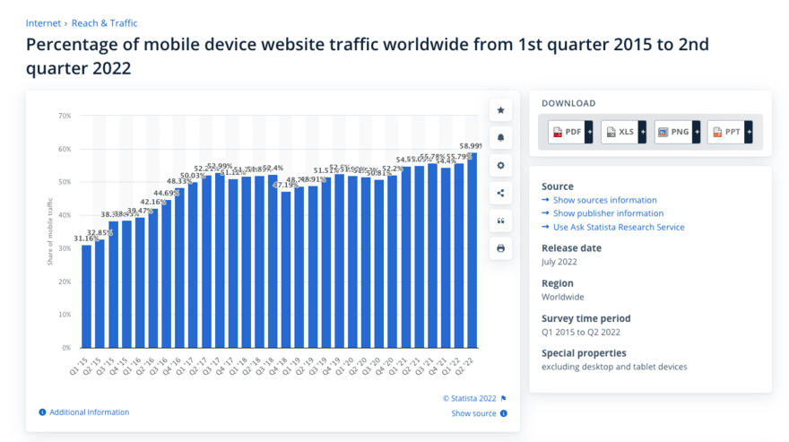
The first and most obvious is simply that more people are using their phones to view websites. This is clear in the data, with a massive 59% of global website traffic coming from mobile devices in 2022.

So, when you make your website mobile-friendly, it offers those who matter most to your business (your customers) the option to view relevant brand content in a way that works for them.
Mobile-first design is also a crucial branding tool. This is simply because when a potential customer visits your site on a mobile device and has a bad experience due to a messy, overcrowded layout meant for viewing on a bigger screen, this can make your brand look outdated.
Finally, although search engines such as Google keep their algorithms a closely guarded secret, it’s widely believed that they favor websites that take a mobile-first approach.
This would make sense, since Google’s ultimate goal is to serve its customers with the best websites based on their needs, and good mobile-first responsive design undoubtedly makes for a better user experience.
How to Implement Mobile First Design
So, how do you make your website mobile friendly? We explore this below.
Content Inventory
Content is probably the biggest aspect that needs considering when making a site mobile-friendly. After all, when you’re using a larger screen, such as those found on laptops, you can easily include lots of content without making the screen seem cluttered. Whereas lots of content can look messy and confusing on a mobile device.
Start by listing out all of the essential content you need to include on your mobile website. This can range from product pages to privacy statements.
If it isn’t essential, don’t include it.
Prioritize Hierarchy
Once you’ve listed all of the essential content, you’ll need to prioritize each element. For example, on a product page, the “buy now” button, as well as the product images, would likely be a high priority.
Take time to consider how you’ll display the most important elements on each page predominantly.
Enlarge Touch Targets
Unlike on a desktop computer, where a small pointer is used to select a target (such as a link), a finger is typically used on mobile devices. This can make it tricky to select small targets, which in turn can frustrate users.
So, it’s important to enlarge all touch targets on your mobile site. This is especially true of your high-priority targets, such as Call To Action (CTA) buttons.
Advice from the Experts
Top Tip: Phone makers such as Apple recommend that touch targets are at least 44px to make them easy to select.
Remove Hovers
Although hovers can be useful on desktop websites, they aren’t compatible with mobile viewing. This can lead to your website becoming very frustrating or totally unusable for visitors.
The lesson from this? Don’t use them in your design.
Remove Large Graphics
Large graphics take up valuable space on mobile devices, but they can also make your website look clunky and give visitors a bad experience.
Typically, images that cover around 640 pixels in width to 320 pixels in height will look best on mobile devices.
Test on A Real Device
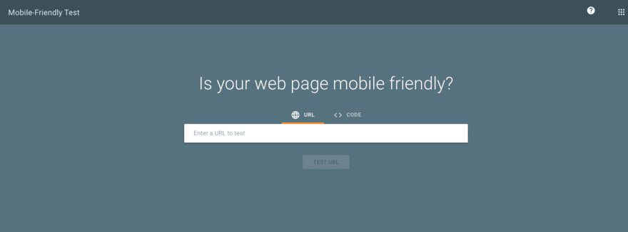
Even with an advanced viewer, it’s difficult to tell how well your website works on mobile if you’re viewing it on a desktop. So, take the time to fully test your site on a mobile device.
See how it looks:
- Is everything readable?
- Are images high-quality?
- Do images fit on the screen?
- Does it look clean and tidy?
Check how it works:
- Is it easy to navigate?
- Can you buy products (on ecommerce sites)?
- Are important touch targets easy to select?

Mobile First Design Best Practices
In the last section, we outlined how to ensure that your website is mobile-friendly. However, to get the most out of your site it needs to do more than just be compatible with mobile.
Here are some quick tips that will help you create a mobile-first design strategy to ensure success.
- Use simple design to make it easy to navigate and pleasant to look at
- Prioritize page content so you know what to make most prominent on each page
- Avoid pop-ups because these can be tricky to close on mobile and frustrate users
- Use bold CTAs to capture the attention of the viewer when they’re using a small screen
- Boost website speed to ensure you don’t lose potential customers due to frustration
Mobile First Design: Summary
With mobile internet usage on the rise, it’s now more important than ever to ensure that your website looks great on mobile devices. By following the simple steps we’ve outlined in this guide you’ll be able to take a mobile-first web design approach, ensuring that whatever device your customers use to visit your site, it’s going to look great and help you convert them into paying customers.


Leave a comment