Inclusivity Matters: 9 Actionable Tips for How to Make a Website Accessible
If you click to purchase a product or service based on our independent recommendations and impartial reviews, we may receive a commission. Learn more
With the rise and continuous improvements of website builders, it’s easier than ever to build a website. But is it easier than ever for everyone to use those websites? Turns out the answer is a resounding no – a staggering 97.4% of websites aren’t accessible to everyone. That means only a tiny 2.6% of websites are accessible to disabled people!
Often, people building websites don’t know how to make a site accessible. The great news is that it’s much easier than you think. You just need the right tools!
Making your website accessible is the right thing to do and it makes good business sense. You don’t want to block a whole group of people from your customer base or audience, so here are nine tips to make your website more accessible that you can start implementing today.
Add Alt Texts to Images
An alt text (also known as an alt attribute or alt tag) is an HTML attribute associated with an image, and its value is a phrase or short description of the image. For example:
It acts as a replacement for the image in case the image fails to load. It’s also used by screen readers and search engine bots to understand the content of the photo.
Adding an alt text with your image ensures that the people and search engine crawlers who can’t see the image can still get a sense of what is depicted by it. So make sure to describe each image you add online with vivid details using the alt text.
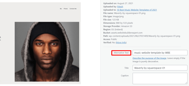
You don’t necessarily need to know HTML to add alt texts to your images, either. If you’re using a modern CMS (content management system) or website builder, you’ll usually get the option to add an alt text in the image settings, whenever you upload visual elements.
Pick Your Colors Wisely
There are many types of vision impairments – such as diabetic retinopathy, retinitis pigmentosa, glaucoma, and cataract – which cause those with them to experience poor sensitivity to color contrasts.
A study of a million websites shows that low contrast is the most common reason (86.3%) for accessibility failures.
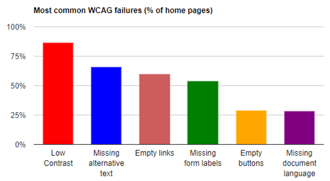
Image Source: WebAIM
Against that backdrop, you’ll need to make sure that the colors you use on your website are not too similar, and are creating enough contrast to be easily distinguishable from one another.
The most essential aspect of this is to make your text easy to read. It should be in such a color that it clearly stands out from the background color. You could either use a dark color with a light background, or vice versa.
The following image, for example, is difficult to read. The colors bleeding into each other, and put an uncomfortable level of strain on the eyes.

Image Source: Wikipedia
This example, by contrast, has a healthy contrast – which makes it far easier to read:

If you’re not sure, you can also use a range of online tools – such as WebAIM and Contrast Checker – to find and evaluate different color pairings, and make your website more accessible.
Use Headings to Structure Content
Another crucial factor when it comes to website accessibility is structuring your content with different levels of headings (H1, H2, H3, and so on), in order to establish a logical hierarchy. This makes your content easy to read and digest. Additionally, headings and subheadings help screen readers make sense of your pages, by providing in-page navigation.
There should only be one H1 tag on your page – that’s supposed to be your main page title. Use H2s for each subheading, and nest further subheadings below in the form of H3s, followed by H4s, and so on. For example:
- [H2] Gather Ingredients
- [H3] Tea Leaves
- [H3] Sugar
- [H3] Pot
- [H2] Boiling with Water
- [H3] Boil Water in Pot
- [H3] Add Tea Leaves and Sugar
- [H3] Let it Boil for 5 Minutes
[H2] Serve Hot
Similar to alt texts, you don’t need to be an HTML pro to add header tags to your content. Most modern CMS and website builders have this setting in their built-in content editor.
Ensure Descriptive URLs
When it comes to accessibility, every little thing matters. And a URL (Uniform Resource Locator) is no exception. This is the address of the webpage you use to access it from your browser. For example, here’s the URL for one of the pages on our website:
From this URL, you can probably guess that the page is about building websites. As such, a descriptive URL is important because it provides context to people and devices – including screen readers, the blind, and people with visual impairments.
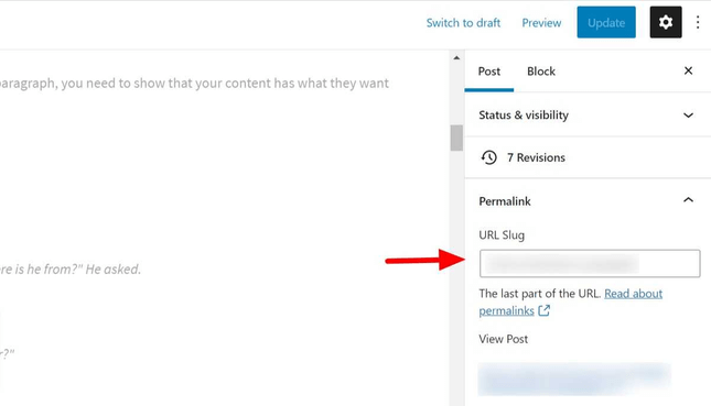
If you’re building a website with your own custom domain and a flexible content management system, you’ll have full control over your URL. In WordPress, for instance, you can set a URL when editing a post or page.
Avoid Small Font Sizes
As you can guess, it’s hard for people with poor vision to read small text sizes. That’s why it’s important to use an appropriate font size for your website. Large fonts and CTA buttons – aside from making your content more accessible across the board – are also good for conversions.
If possible, you should also create an alternative style sheet for people with disabilities, which they can activate from your website.
Find Out More
In our interview with Cameron Heinz, founder of Mobility Nest, we loved hearing how he makes his Shopify store accessible using apps that allow users to increase text size or color contrasts!
Allow Keyboard Navigation
According to WHO, 217 million people globally suffer from moderate to severe vision impairment. Users who are blind or visually impaired cannot use a mouse to navigate your website, and instead will typically use Braille keyboards to browse.
Don’t make navigation a challenge for your users with vision difficulties – instead, ensure you’ve incorporated keyboard navigation into your website. What this means is that users should be able to access key elements of your website just from the keyboard. These include:
- Menu items
- Anchor texts
- Form fields
- Widget
- CTAs and other buttons
- Dialog boxes
Essentially, users shouldn’t need a mouse to get to these components of your site. So how can you ensure this? First of all, use a CMS or website builder with accessibility features built-in. To do this, it’s worth checking its documentation to see if it supports building websites that are fully navigable by keyboard. Good navigation and an easy user journey are essential website features that shouldn’t be overlooked.
Also, when you use a third-party widget or plugin – such as a form-building extension – make sure that the developers of the plugin have taken accessibility into account.
Make Multimedia Accessible
Videos, audio, and other multimedia elements are essential to provide a high level of user experience, and boost engagement on your website.
But different users may have different needs, based on the disabilities they have. For instance, people with visual impairments may not read text or view images, but they can listen to audio. And deaf users can obviously watch a video, but can’t hear any sounds from it.
With that in mind, it’s best to provide as many ways as possible for visitors to understand your content. This includes writing video and audio transcripts for your multimedia embeds, or giving users the option to listen to the text instead of reading it.
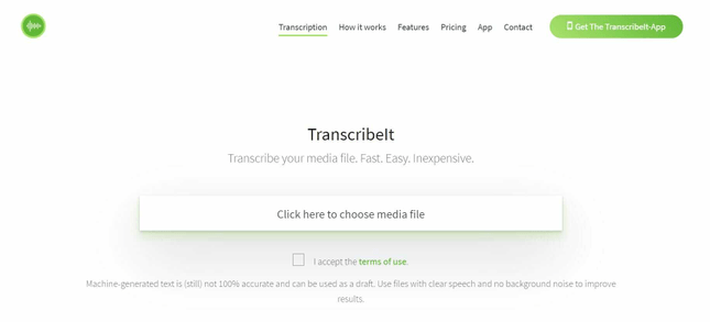
You can use services such as Descript, Scribie, and Transcribe It to turn your audio and video files into text.
Also, it’s better to use an accessible multimedia player to stream your audio and video files. Modern players based on HTML5 are more likely to incorporate accessibility into their user experience – so we’d recommend checking them out as a first port of call.
Structure Your Content Properly
Picture this: you walk into a library, and instead of neatly organized shelves, you find books thrown all over the place. Nothing on shelves. No Dewey Decimal System. Sounds like a nightmare, right?
That’s just how an unstructured website feels to screen readers and assistive technologies. That’s why semantic HTML is important. Semantic HTML elements are like little road signs and landmarks when you’re driving through a new place. They help you orient yourself.
They include labels like main, article, section, header, and footer.
Semantic HTML gives your content purpose and context, and enhances user experience and readability. It also boosts your SEO by giving clear structure and content that means something.
So, when organizing your website, make the most of semantic HTML. Use landmarks and ARIA roles to create “anchors” that help users navigate different sections with ease. Offer skip links for users to bypass repetitive navigation and jump straight to the content.
Also, go for descriptive link texts instead of a generic “click here” so users know where they are going!
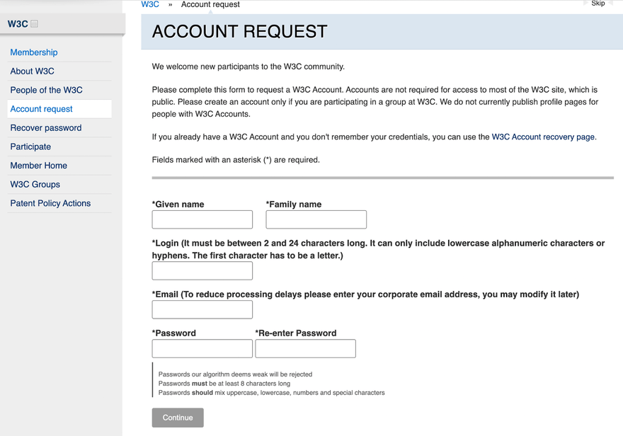
Make Forms Accessible
Most of us really don’t like forms. However, they’re often necessary and must be accessible to everyone to reduce your bounce rates and increase your engagement (and audience)!
When you make your forms accessible, users with visual, motor, or cognitive impairments can interact with your site. You can do a few things to make your forms more accessible: give your form elements good labels, give clear instructions and guidance, and offer helpful form validation and accurate error notifications.
You can get more information on forms from accessibility websites too.
How to Check Your Website Is Accessible
There are a number of tools and resources available to carry out a quick audit of your website for accessibility. Start with a basic list of easy checks put together by the W3C. It’ll help you identify the most common problems, such as photos without alt-text, missing headings, and inappropriate color contrast.
In addition, be sure to make use of the many free and premium accessibility audit tools available online. These include webaccessibility.com, Wave, and SortSite.
How Have Other Sites Done It? Webflow Case Study
One of our favorite examples is about a web development platform called Webflow who wanted to make their website accessible. They brought in expert Michele Landis to help. These are the actions they took and content they made:
- Accessibility landing page with a formal Accessibility Statement
- Accessibility video courses
- Easy-to-understand accessibility checklist based on WCAG guidelines
- External communications via social media and email
- Case study of an accessible site
- Internal panel discussions and speaker events
The effort totally paid off for them. Not only did they suddenly make their brand visible to millions of disabled people, but according to the case study here are the results:
- 121K GAAD-related social media impressions
- 3K views of the accessibility page
- 1.7K tasks completed on the accessibility checklist
- 800 enrolments in the Webflow University accessibility course
Which just goes to show that everyone benefits from making your site a more accessible place!
Website Accessibility: Summary
There are millions of people globally who need the web to be accessible. If you don’t put the necessary efforts into optimizing your website as per their needs, then you could end up being part of the problem. These days, building a website isn’t all that difficult – and, as we discussed above, making your website accessible doesn’t have to be, either. You have plenty of tips and tools at your disposal – so go deploy them!
To recap:
9 Ways to Make Your Website Accessible
- Add Alt Texts to Images
- Pick Your Colors Wisely
- Use Headings to Structure Content
- Ensure Descriptive URLs
- Avoid Small Font Sizes
- Allow Keyboard Navigation
- Make Multimedia Accessible
- Structure Your Content Properly
- Make Forms Accessible
Take these steps to make your site welcoming to all types of visitors, regardless of their medical condition. After all, people with disabilities spend a half-trillion dollars per year. But, regardless of whether they’re your potential customers or not, people with disabilities are a vitally important part of the big community we call the world wide web. Whatever good you spread in the world, it’ll always find a way to come back – so get going!


Leave a comment