Touch Screen 2.0 – The Future of Mobile Websites is in Responsive Design
If you click to purchase a product or service based on our independent recommendations and impartial reviews, we may receive a commission. Learn more
Are you ready for the next evolution in touch screens?
Elon Musk is.
You probably heard of the successful launch of Falcon Heavy, as well as its special cargo: a new Tesla Model 3. What does this have to do with responsive design, you might be thinking?
Well, one of the major features of the Model 3 is its advanced touch screen console. And touch screen technology is so important in our world right now especially when it comes to website design.
Just consider the explosion of mobile devices and touch screens over the last few years. According to Statista, global mobile data traffic currently accounts for almost 50% of all website views worldwide and that is expected to grow seven-fold over the next 5 years.
So, where does this leave you and your business? How well do you think can compete in the world of mobile?
To figure out how well you can compete, let’s look at the state of mobile websites.
According to the Clutch Small Business Survey, 71% of the small businesses surveyed had websites and of those businesses 79% said their websites were mobile-friendly.
That means that those businesses invested in responsive design: design that is programmed to adapt to and respond to various devices and screen sizes, including mobile devices and other devices with touchscreens.
The truth about mobile and responsive design
So, what’s the big deal? Maybe your website is fine the way it is. Maybe you get enough views, shares, likes, purchases, etc. Maybe you have a decent mobile site that people use often enough.
The big deal is that things aren’t the way they used to be.
Times change, people change, and so does your website, unless you want to be left behind.
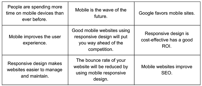
Here’s the truth about mobile and responsive design:
These are just a few of the truths about responsive design and mobile websites that will lead you to results than you ever thought possible.
Ready to hear about how you can get into responsive design?
How to use responsive design
To make sure that the stars align and your website is ready for mobile and the touch screens on mobile devices, you need a good designer who lives, eats, and breathes responsive design.
No matter where users view your content, they will get the superior quality they have come to expect from you.
Think about one of the gods of the internet: Facebook.
When you go to Facebook on a desktop computer, mobile phone, tablet, smartwatch, or smart TV, they have used responsive design to make sure the user experience is flawless across all devices.
Just a warning, though.
This is not easy. Responsive design requires more planning and thought than just plugging in some website elements on a desktop computer template, especially when it comes to effectively using a touch screen.
There are many elements to consider when your website makes the jump to touch screen.
A finger, not a mouse
First things first, your finger is not a mouse.
So when designing for a touch screen, you have to take into consideration how a finger moves across a screen versus how a mouse moves across a screen.
Fingers gesture, tap, and have more than one input (meaning two or three fingers). A mouse is a more basic move and click set-up.
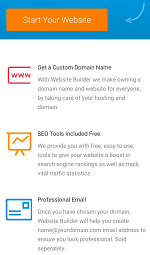
 Putting it into practice: The Website Builder mobile site uses many responsive design features to make sure that the site is specific to mobile devices, making it more user-friendly and inviting. Responsive design takes into account using a swipe up and down to navigate, a pinch to zoom, a tap to select, and a swipe left or right to access menus or other pages making the mobile site simplistic and easy to navigate using a finger on a small screen.
Accuracy
When using a mouse on a desktop website, the cursor is quite precise.
Most people have fingers that are much bigger than a cursor, which means that the design on a touch screen needs to be adapted to fit the size of a person’s finger.
Putting it into practice: When thinking about designing for a mobile touch screen, think about how the mobile version of Website Builder looks. The button to open the menu is large and is not situated too close to other buttons. The text links are all big enough, with enough space between each one to avoid an incorrect click, from even the biggest fingers.
 Movements
The desktop version of a website requires the mouse or the scrollbar to be used to move up and down a page. If you want the page to go up, you move the mouse down. On a touch screen, gestures have to be used to move around the page. Using these settings, to move the page up, you swipe up. This is a slight, but important difference when it comes to website design.
Putting it into practice: Movements on a mobile site should take is a few swipes up or down and everything should be right there. Information should be formatted so that users do not have to swipe left or right. Everything should be formatted to fit into the dimensions of the screen. Another element that creates a user-friendly mobile site is to put all the clickable links and main elements on the left, since most people scroll using the right side of the screen.
 Glare
Glare
When designing for touch screens, you have to make sure that your website will look good in all light conditions.
The thing with mobile devices is that they can go everywhere from bright daylight to the dark of night and everywhere in between.
Putting it into practice: The team who designed the Website Builder mobile site also took into consideration the way that a mobile site is viewed in all settings. Using a white or light colored background, without too much black, helps the user see the content in various light conditions.
Keyboard
The keyboard in an important aspect of interacting with a website.
When using a touch screen device the keyboard placement is important to consider in regards to the placement of other elements on the page.
Putting it into practice: When the keyboard appears the user should be able to interact with the site easily, without losing too much of the view. On this site, the text inputs are short and can still be viewed clearly even with the keyboard taking up a large portion of the screen. The designers also took into consideration that some users find it difficult to type too much at one time on a mobile touch screen keyboard.
Touch screen tips and tricks
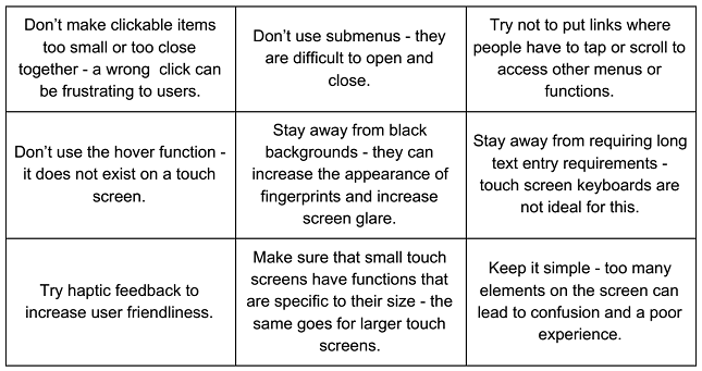
To make your job a bit easier, take a look at this summary of design elements for a touch screen-friendly mobile website.
 Now comes the fun part.
You have used responsive web design to improve the functionality and user experience of your website on mobile devices and touchscreens.
But will you be ready for touch screen 2.0. Looks like there is more designing ahead.
The future of touch screens
So, you have your site up and running, you are using responsive design, and all the best features of a touchscreen.
You are all set, right? Well, not so fast. Just like every technology, touch screens are also evolving pretty rapidly. If you want to keep your website up-to-date, you also have to look at the technical aspects of new devices and technologies as well as the content on your site.
Multi-touch screens
Touch screens started as just a single-touch device.
Over time, the technology has developed to include two- and three-finger touch responses. Users will adapt to these functions and come to expect them in all websites they visit. If you want to stay ahead of the competition, start considering how you can incorporate multi-touch responses in your website design.
Projected touch screens
Another thing to look for in the future is the projected touch screen.
AR/VR and touch screens come together to create an interactive touch screen that can be projected on a flat surface. Using these features, the design of your website might need to be adapted so that it can be even more interactive. Imagine how a consumer could project your website on any flat surface and interact with your content. With AR, they could place different objects on the projected touch screen which would then appear on the website in some way.
The possibilities are endless with this kind of technology.
Pressure sensitive touch screens
Our current phones and other devices are not good at detecting how much pressure we use to tap.
Whether we are lightly tapping on the screen while laying in bed at 3 am or angrily tapping on the screen out of frustration, the screen responds in the same way.
One day soon that might change. Maybe the tap with pressure could close the window or click, while a lighter tap could open a pop-up menu. Anything is possible.
Optical recognition touch screen
In most, if not in all, mobile devices, the camera and the touch screen are two distinct features.
But soon, the screen might also be a camera. Using infrared light, the screen will be able to see what is touching the surface. In order for websites to make the most of this function in the future, designers will have to create websites that can make use of this new “sight”.
Are you ready for responsive design?
You don’t need to be Elon Musk to make the most of a touch screen and you don’t need to try to make the Model 4. A beautifully designed website with excellent user experience is all you need. With a little planning and an eye on the future, you can make sure you always stay ahead of the competition with responsive design.


Leave a comment